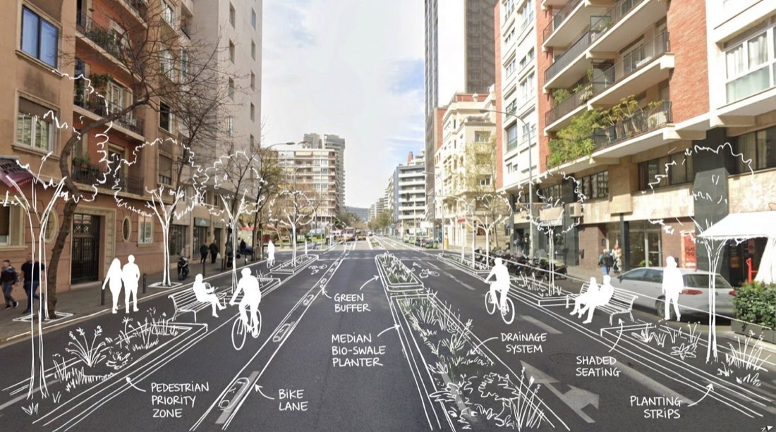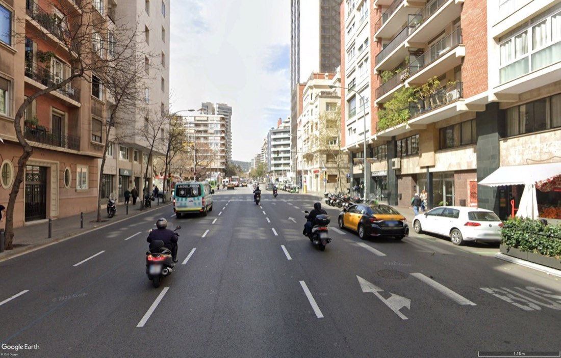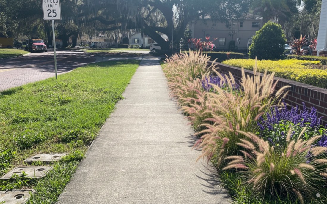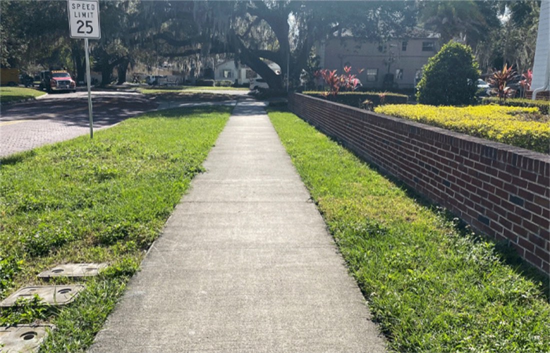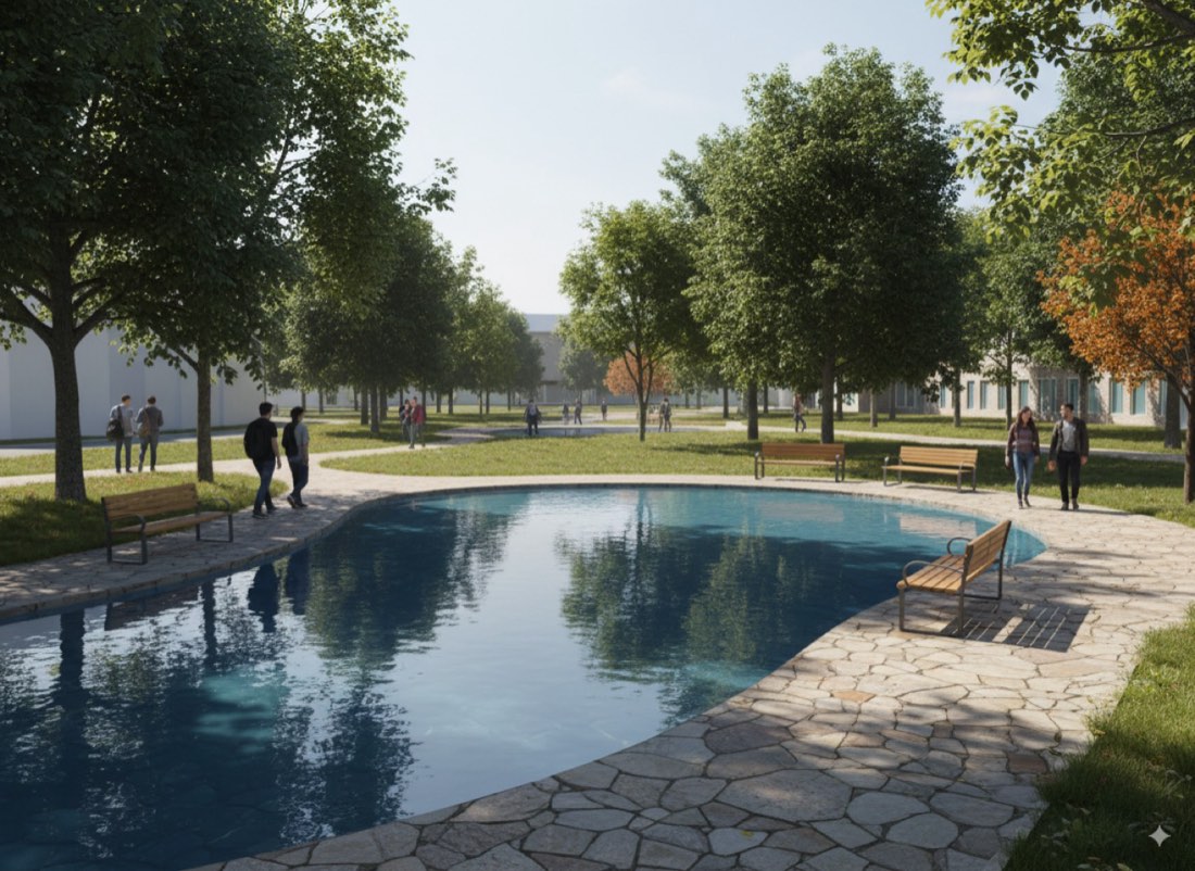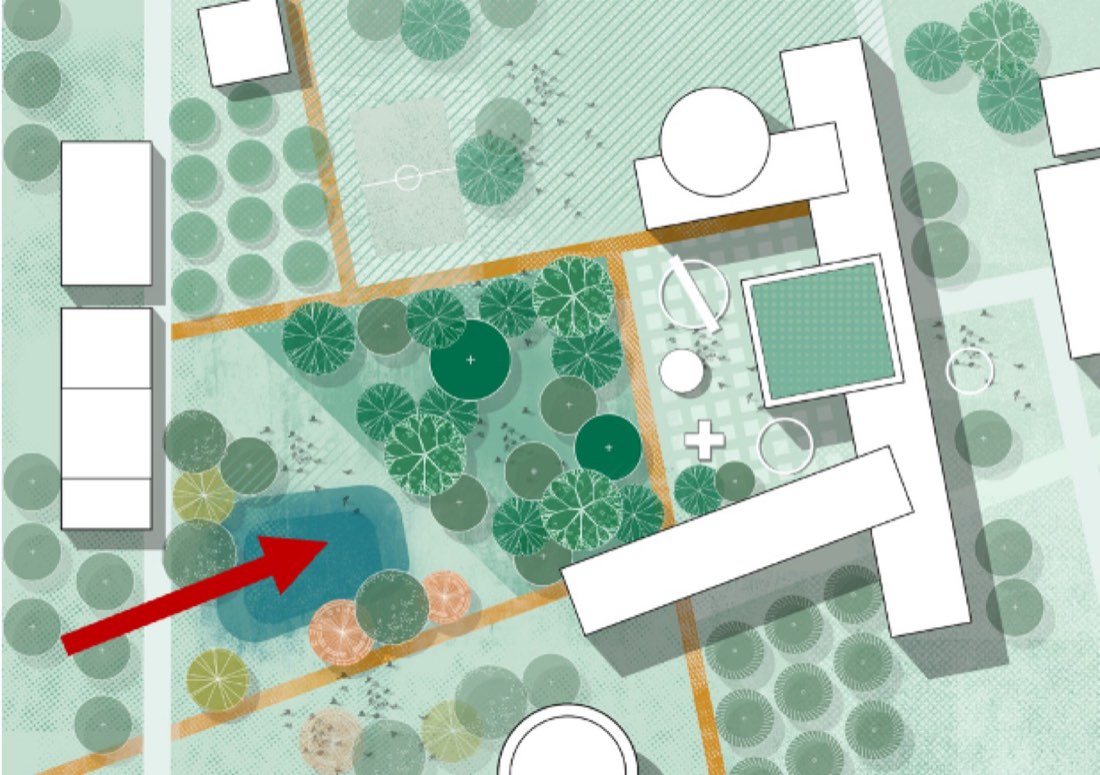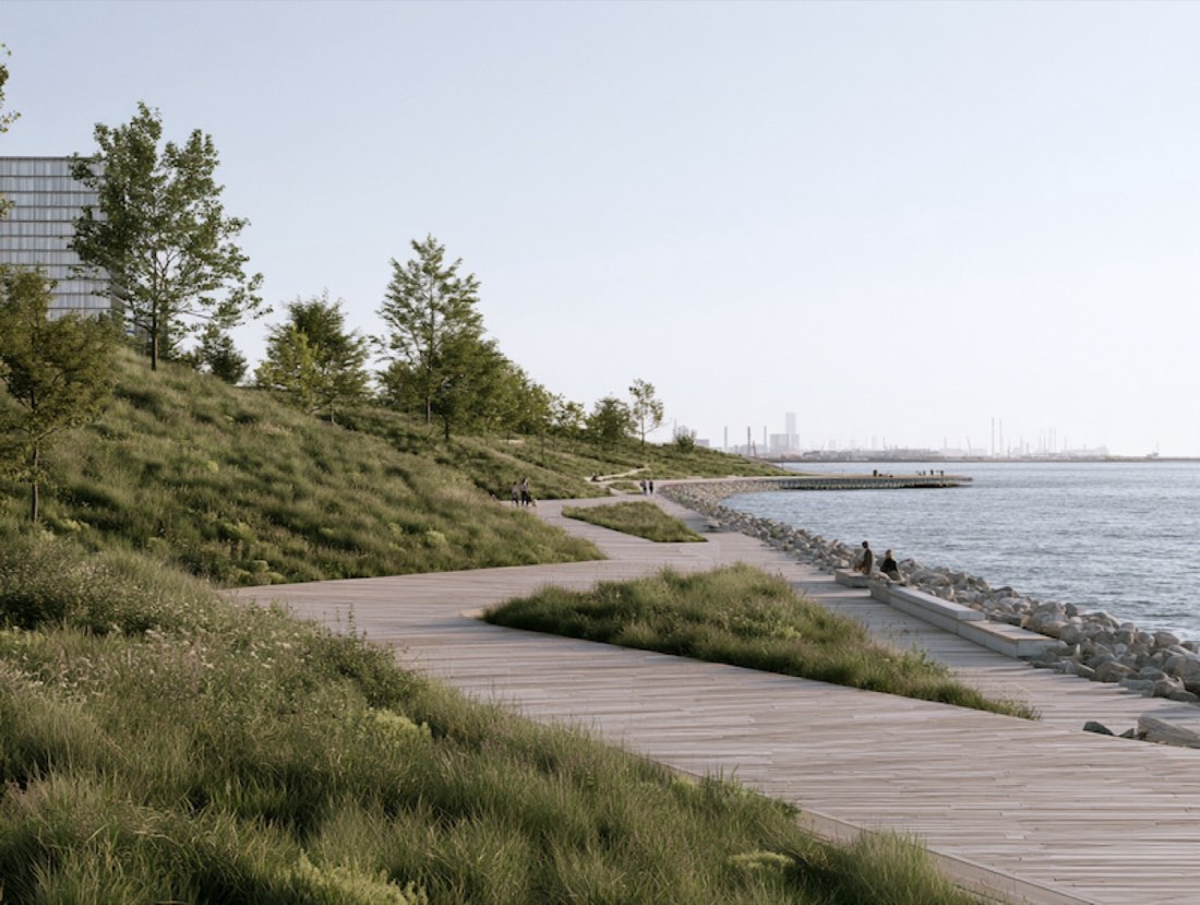
 原图结果
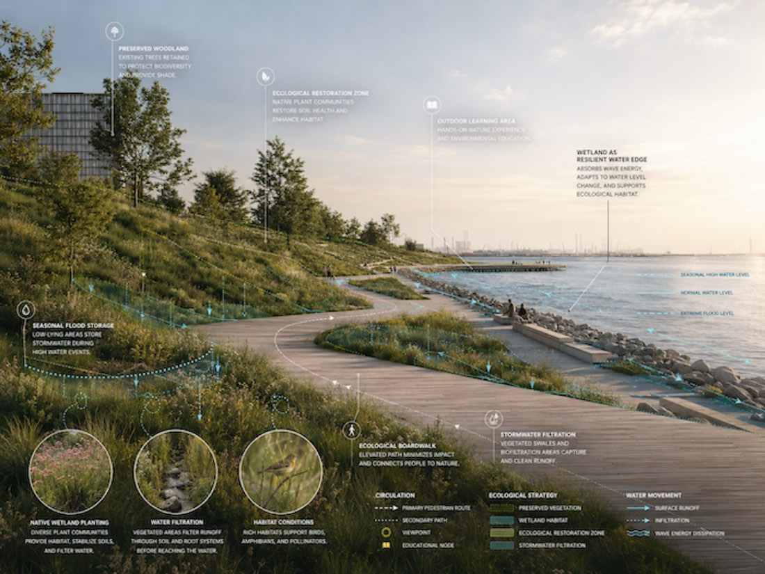
效果图转分析图叠加
把我上传的景观设计效果图,转换为一张叠加分析图层的专业景观设计可视化图。 保留设计: 完全保持我上传图像中的原有景观设计、相机角度、透视、空间布局、地形、道路、木栈道、水体、种植区、建筑、构筑物和主要设计元素。 不要重新设计场地。给图像加入少量阳光效果。 底图渲染风格: 生成写实而精致的景观设计竞赛效果图。 使用: - 柔和的自然日光 - 略带氛围的天空 - 写实的湿地和草甸种植 - 自然的水面倒影 - 有层次的本土植被 - 写实的木材、石材、土壤和种植质感 - 细微的纵深和空气透视 - 自然使用景观的人们 - 专业的建筑可视化,而不是电影式 CGI 效果图保持略微低饱和、有杂志感,让分析图示清晰可见。 分析图层: 在透视效果图上直接叠加建筑和景观分析图示。 图示应像在专业景观效果图上用 Adobe Illustrator 精心绘制的。 使用细而精确的矢量线条,而不是大块不透明的图形。 展示相关的景观系统,例如: - 交通与人行流线 - 湿地分区 - 生态栖息地 - 雨水管理 - 可淹没景观 - 高水位 - 常水位 - 种植分区 - 保留植被 - 生态修复 - 科普教育区 - 观景点 - 木栈道连接 - 公共活动区 只展示对上传项目有意义的分析信息。 水与生态分析: 适当时,清楚表现水与景观的相互作用。 用细的青色或蓝绿色分析线表示: - 常水位 - 季节性高水位 - 淹没范围 - 水流方向 - 下渗 - 排水 - 湿地过滤 让部分分析线顺着透视中实际的地形和水面走,使图示在空间上融为一体,而不是贴在图上。 次要的生态边界用点线和虚线表示。 标注: 用细的白色或浅色引线,在重要设计要素处加入几个克制的分析标注。 可用的标注包括: 湿地作为韧性水岸 生态木栈道 本土湿地栖息地 季节性蓄洪 保留林地 户外学习区 生态修复区 雨水过滤 使用简洁的建筑语言。 不要让文字挤满效果图。 细节放大圈: 在适当位置加入 2–3 个淡淡的圆形放大细节窗口。 用来突出: - 湿地种植 - 栖息地状况 - 水过滤 - 季节性植被 - 生态细节 每个圆圈精确连接到对应位置。 圆圈保持部分透明,在视觉上与效果图融为一体。 图示语言: 使用克制的配色: 白色——标签和主要标注 青色/蓝绿色——水文和水系统 柔和绿色——生态和种植系统 极少量黄色——重要的生态或体验亮点 使用细线、虚线边界、半透明填充、小箭头和精致的分析符号。 避免粗箭头和过大的信息图图标。 字体: 使用干净的建筑无衬线字体。 标签应: - 全大写 - 紧凑 - 白色或柔和中性色 - 对齐清楚 - 间距专业 主要策略标签与次要标注之间保持清晰的层级。 风格目标: 最终图像应像一张高端景观设计竞赛可视化作品,结合: 写实景观效果图 + 生态分析 + 水文策略 + 建筑标注。 它应像一张专业渲染、并经过 Photoshop 和 Adobe Illustrator 精心后期处理的景观透视图。 重要: 避免 AI 生成的信息图感。 不要使用: - 过多的发光线条 - 霓虹图形 - 随意的图标 - 过大的标签 - 过多的箭头 - 悬浮的 UI 元素 - 浓重的渐变 - 未来感 HUD 图形 - 卡通式分析图 - 过饱和的效果图 - 过多的标注 让分析图层保持低调、精确、技术性和优雅。景观效果图必须始终是视觉主体,分析图则解释设计在环境和空间上如何发挥作用。
Transform my uploaded landscape architecture rendering into a professional landscape design visualization with integrated analytical diagram overlays. PRESERVE THE DESIGN: Keep the original landscape design, camera angle, perspective, spatial layout, landform, paths, boardwalks, water bodies, planting areas, buildings, structures, and major design elements exactly as shown in my uploaded image. Do not redesign the site. add minor rendering sun lights to the image. BASE RENDERING STYLE: Create a realistic but refined landscape architecture competition rendering. USE: - soft natural daylight - slightly atmospheric sky - realistic wetland and meadow planting - natural water reflections - layered native vegetation - realistic timber, stone, soil, and planting textures - subtle depth and atmospheric perspective - people naturally using the landscape - professional architectural visualization rather than cinematic CGI The rendering should remain slightly desaturated and editorial so that the analytical graphics are clearly visible. ANALYTICAL OVERLAY: Overlay architectural and landscape analysis graphics directly onto the perspective rendering. The graphics should feel carefully drawn in Adobe Illustrator over a professional landscape rendering. Use thin, precise vector linework rather than large opaque graphic shapes. SHOW RELEVANT LANDSCAPE SYSTEMS SUCH AS: - circulation and pedestrian movement - wetland zones - ecological habitat - stormwater management - floodable landscape - high water level - normal water level - planting zones - preserved vegetation - ecological restoration - educational areas - viewpoints - boardwalk connections - public activity areas Only show analytical information that makes sense for the uploaded project. WATER + ECOLOGY ANALYSIS: Where relevant, clearly illustrate how water interacts with the landscape. Use thin cyan or turquoise diagram lines to indicate: - normal water level - seasonal high water level - flood extent - water movement - infiltration - drainage - wetland filtration Allow some diagram lines to follow the actual terrain and water surface in perspective so the graphics feel spatially integrated rather than pasted onto the image. Use dotted and dashed lines for secondary ecological boundaries. CALLOUTS: Add several restrained analytical callouts connected to important design features using thin white or light-colored leader lines. POSSIBLE CALLOUTS INCLUDE: WETLAND AS RESILIENT WATER EDGE: ECOLOGICAL BOARDWALK: NATIVE WETLAND HABITAT: SEASONAL FLOOD STORAGE: PRESERVED WOODLAND: OUTDOOR LEARNING AREA: ECOLOGICAL RESTORATION ZONE: STORMWATER FILTRATION: USE CONCISE ARCHITECTURAL LANGUAGE.: Do not overcrowd the rendering with text. DETAIL MAGNIFIERS: Include 2–3 subtle circular magnified detail windows where appropriate. USE THEM TO HIGHLIGHT: - wetland planting - habitat conditions - water filtration - seasonal vegetation - ecological details Connect each circle precisely to its corresponding location. The circles should remain partially transparent and visually integrated with the rendering. GRAPHIC LANGUAGE: USE A RESTRAINED PALETTE: WHITE — LABELS AND PRIMARY ANNOTATIONS: cyan / turquoise — hydrology and water systems soft green — ecology and planting systems very limited yellow — important ecological or experiential highlights Use thin lines, dashed boundaries, translucent fills, small arrows, and delicate diagrammatic marks. Avoid thick arrows and oversized infographic icons. TYPOGRAPHY: Use clean architectural sans-serif typography. LABELS SHOULD BE: - uppercase - compact - white or muted neutral - clearly aligned - professionally spaced Maintain a strong hierarchy between major strategy labels and secondary annotations. STYLE TARGET: The final image should feel like a high-end landscape architecture competition visualization combining: realistic landscape rendering + ecological analysis + hydrological strategy + architectural annotation. It should resemble a professionally rendered landscape perspective that has been carefully post-produced in Photoshop and Adobe Illustrator. IMPORTANT: Avoid an AI-generated infographic appearance. DO NOT USE: - excessive glowing lines - neon graphics - random icons - oversized labels - excessive arrows - floating UI elements - heavy gradients - futuristic HUD graphics - cartoon-style diagrams - overly saturated rendering - excessive annotations Keep the analytical layer subtle, precise, technical, and elegant. The landscape rendering must remain the dominant visual element, while the diagrams explain how the design performs environmentally and spatially.