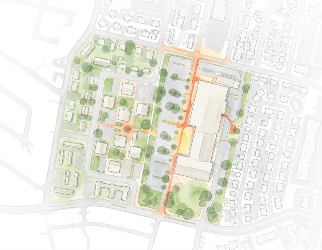
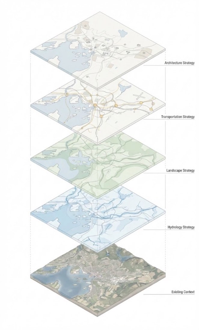
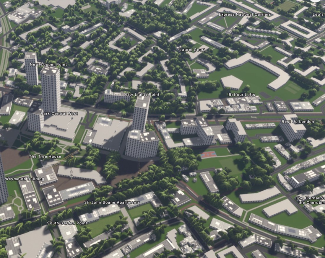
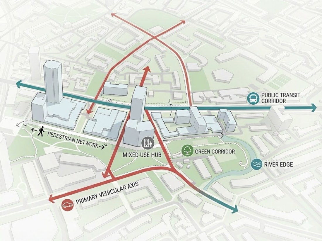
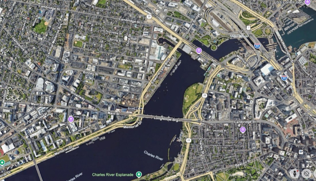
Advanced Practice for Urban Design maps, masterplans and urban diagrams.
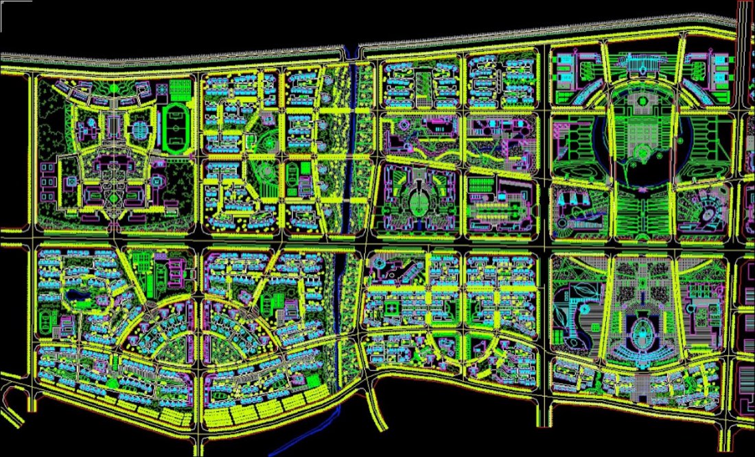
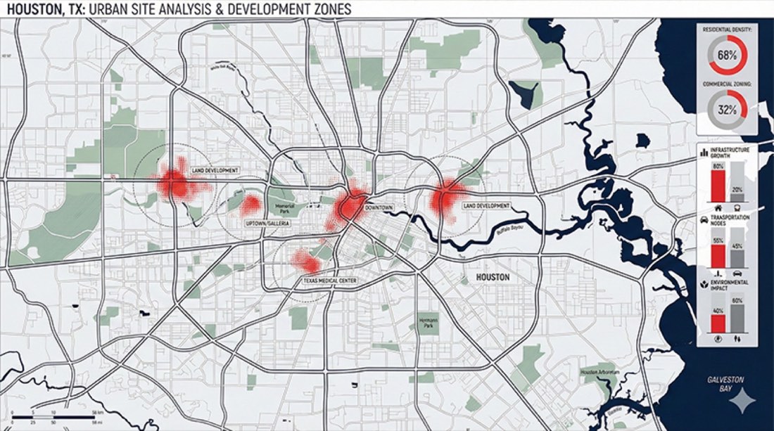
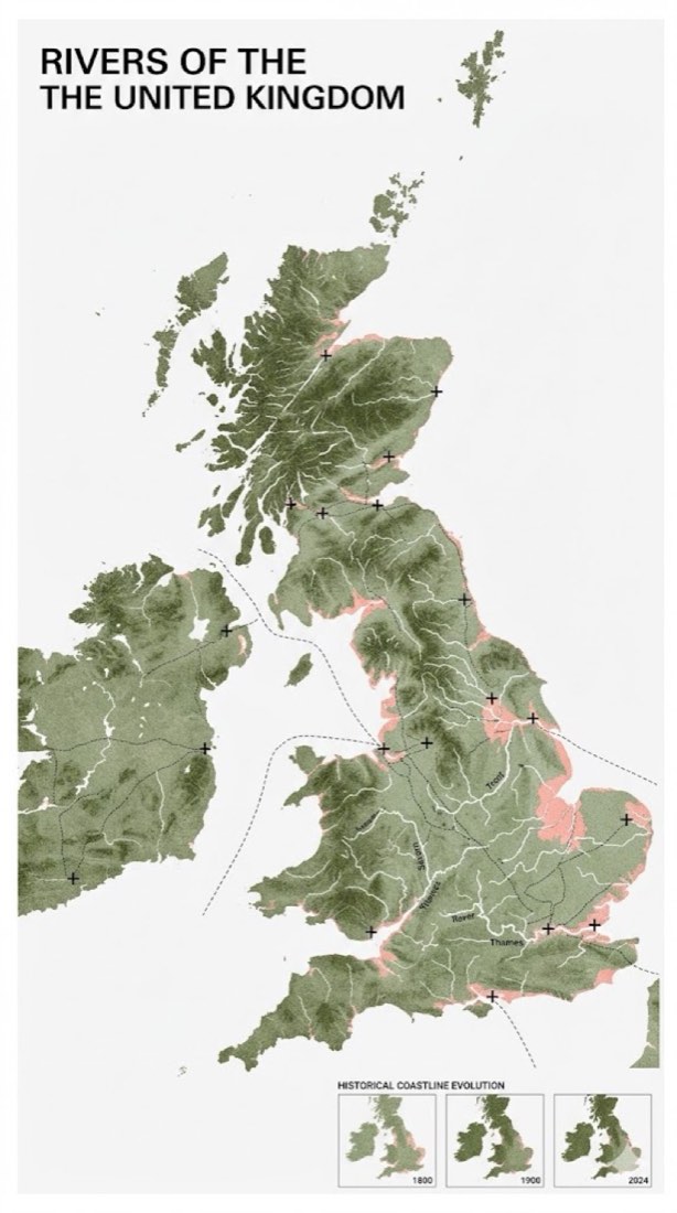
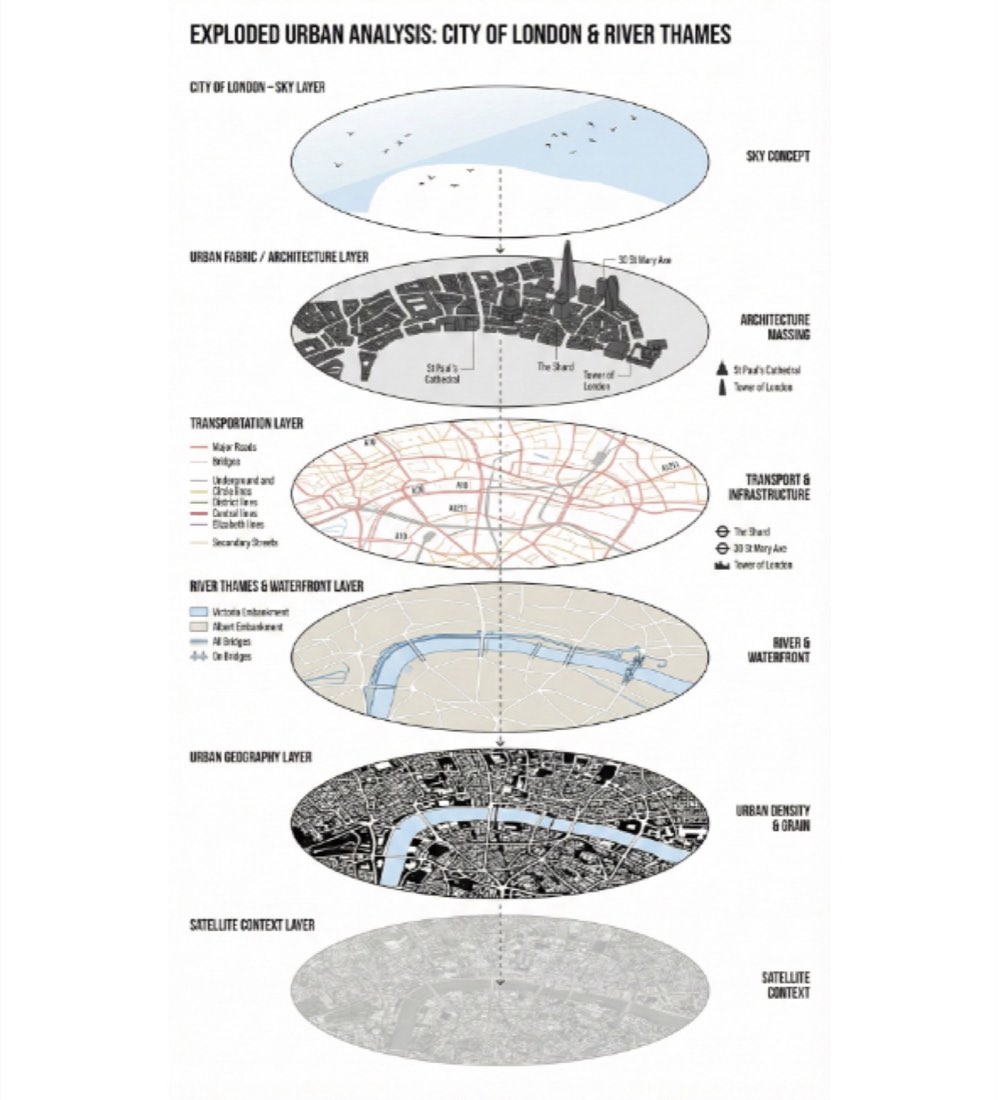
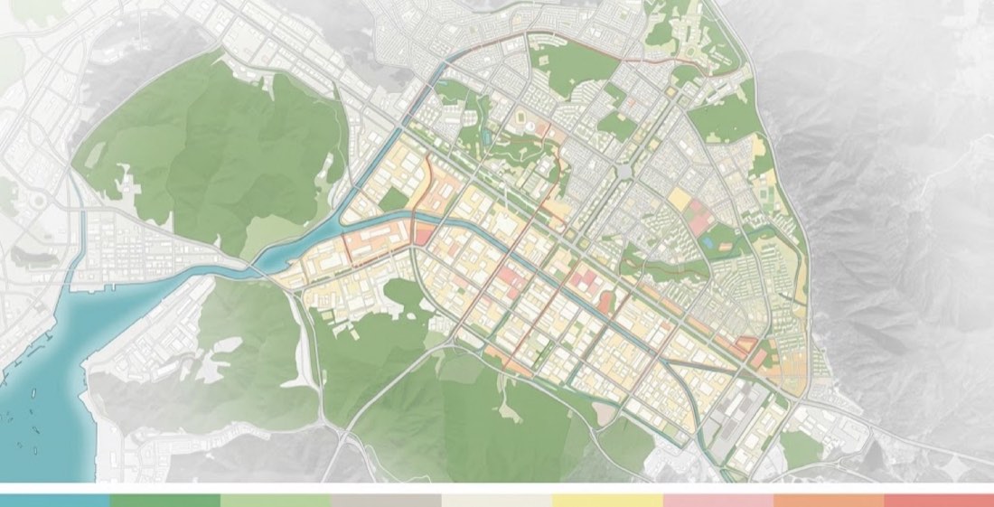
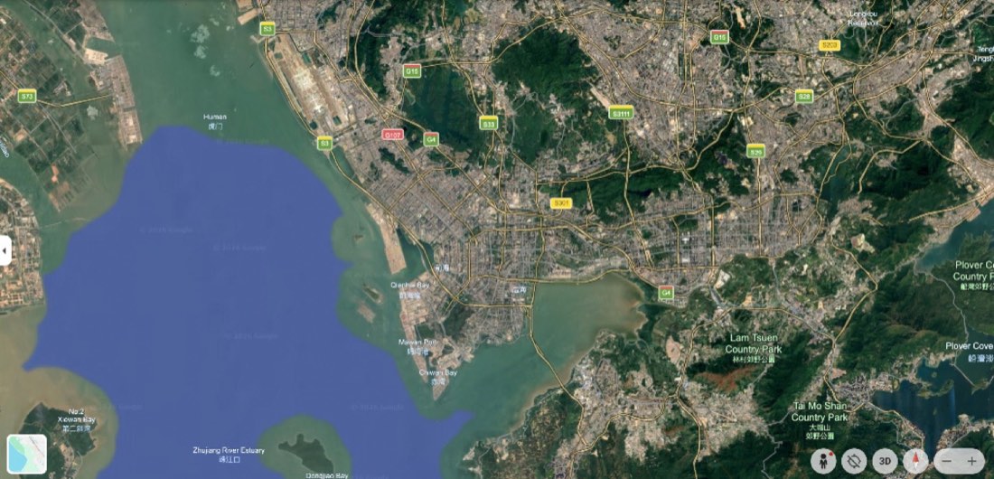
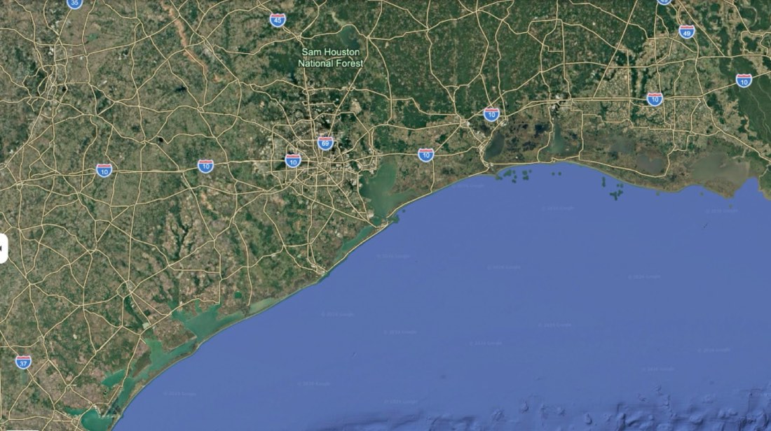
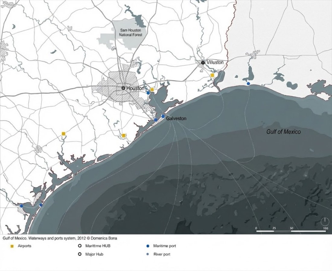
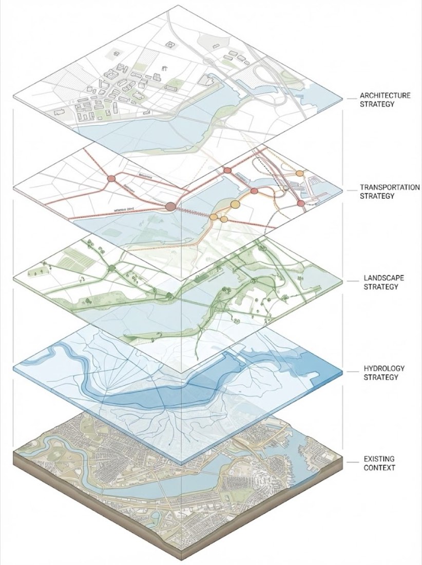
Aerial tracing, masterplan renderings, contour models, mapping and urban diagrams. Trace Google Aerial Photo, CAD Masterplan to Rendering, Contour Map to 3D, Plan to Birdseye, Mapping, ChatGPT Mapping, Aerial Photo to 3D Diagram, Model to Urban Diagram, Sketch to Urban Plan.
✦ Before → After5 examplesExample 01 · FreeOpen lesson →
Example 01
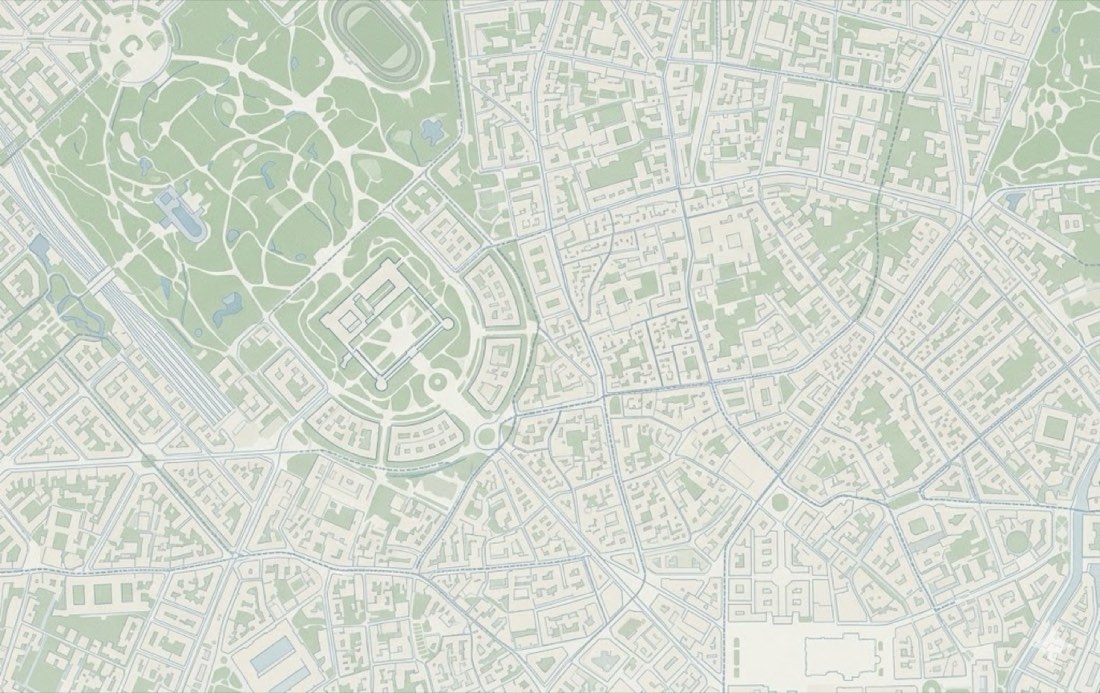
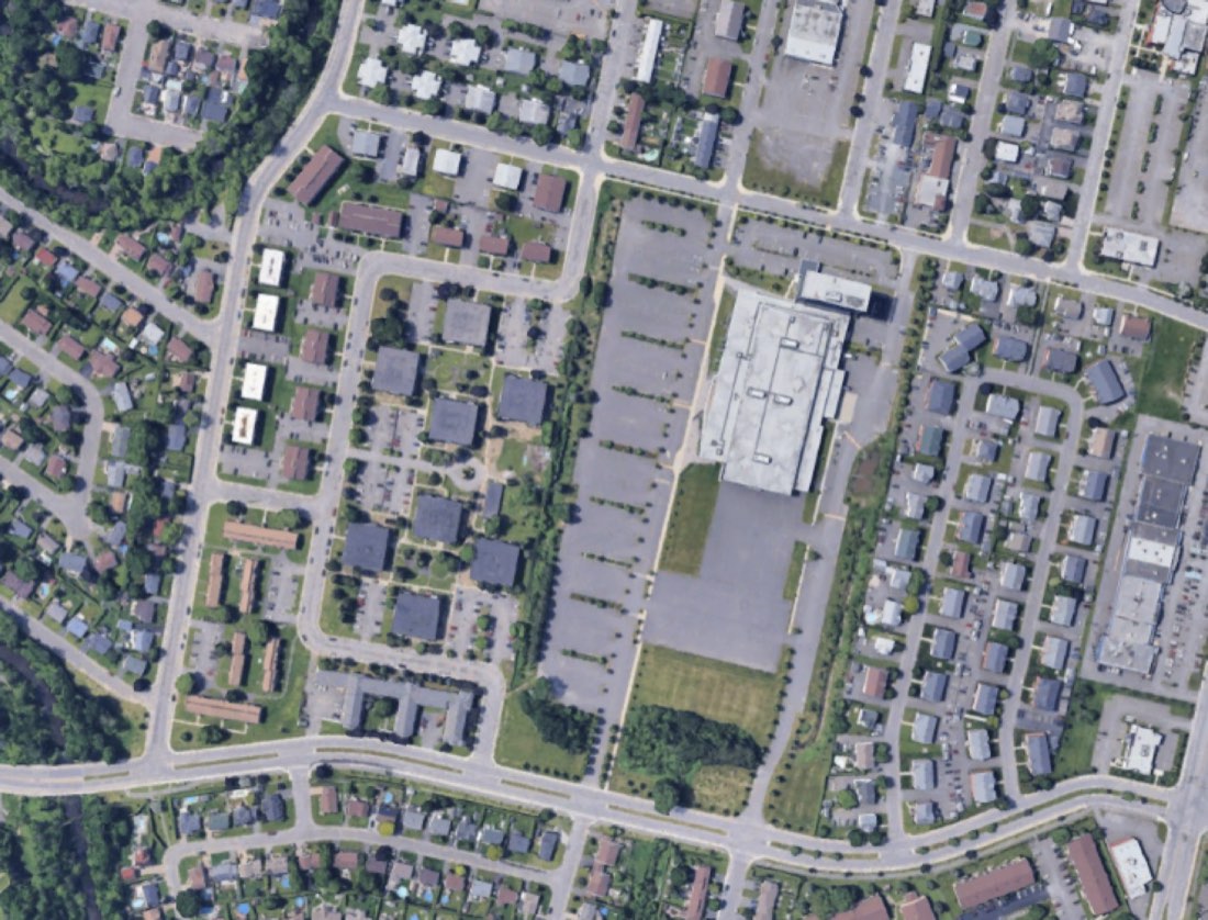
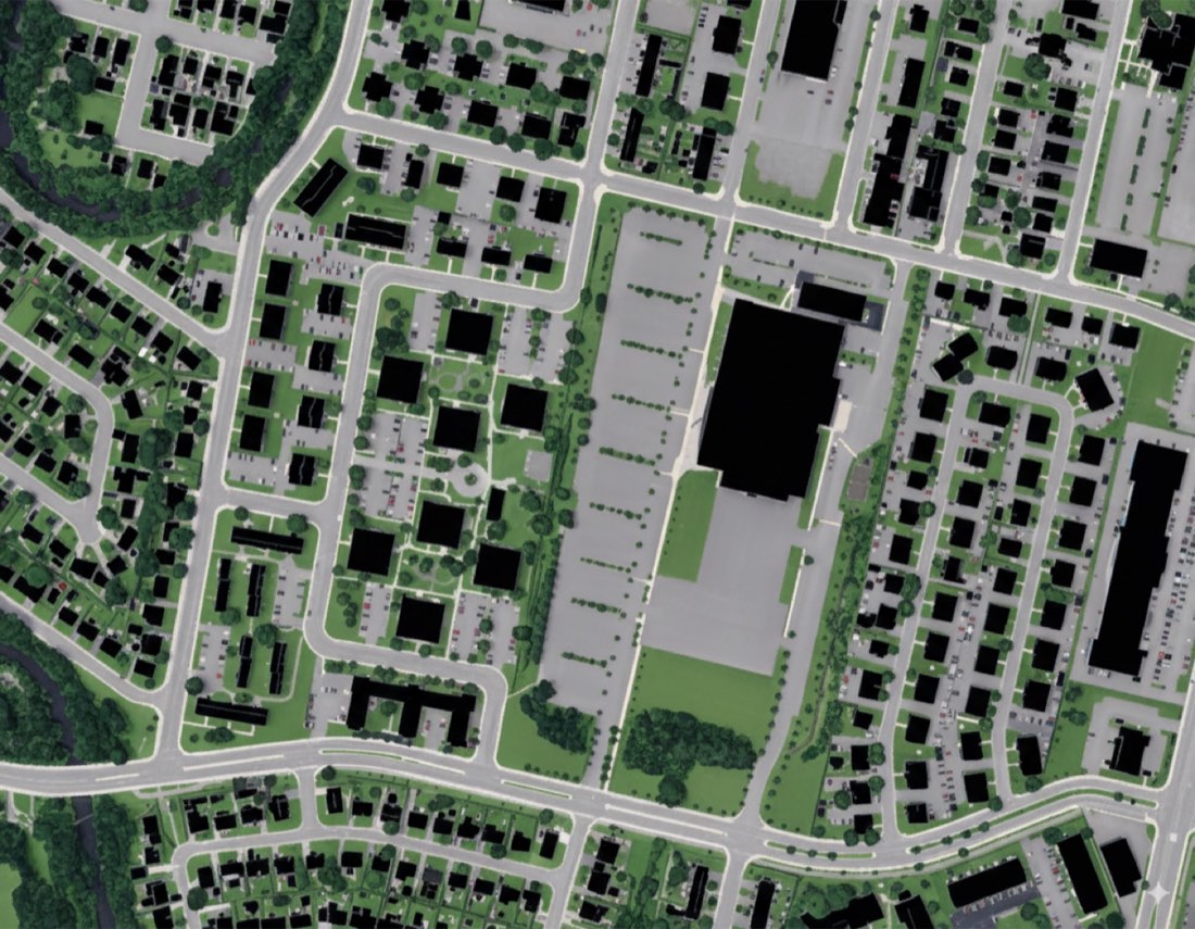
BeforeNano Banana (ChatGPT failed)
Nano Banana (ChatGPT failed)
Prompt · Free prompt
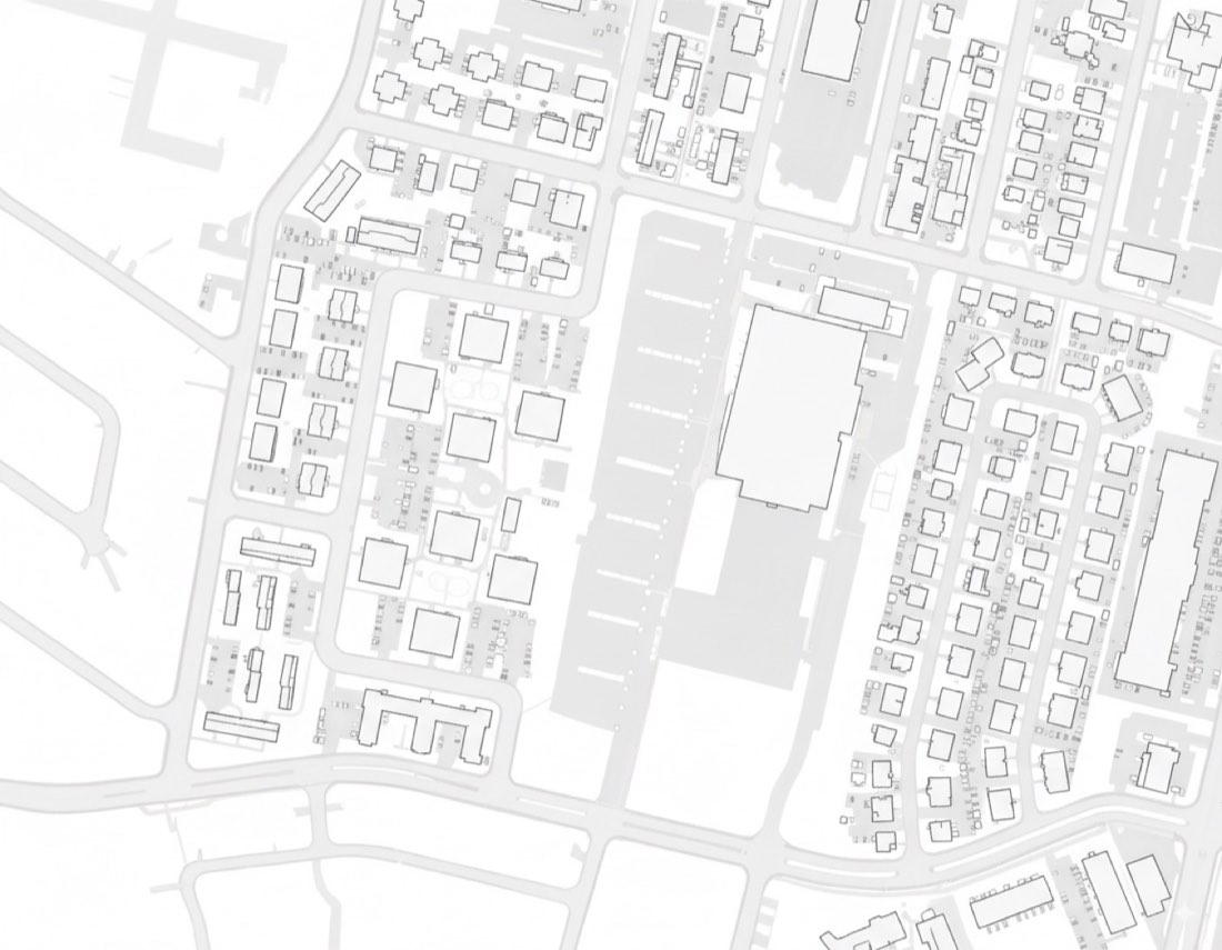
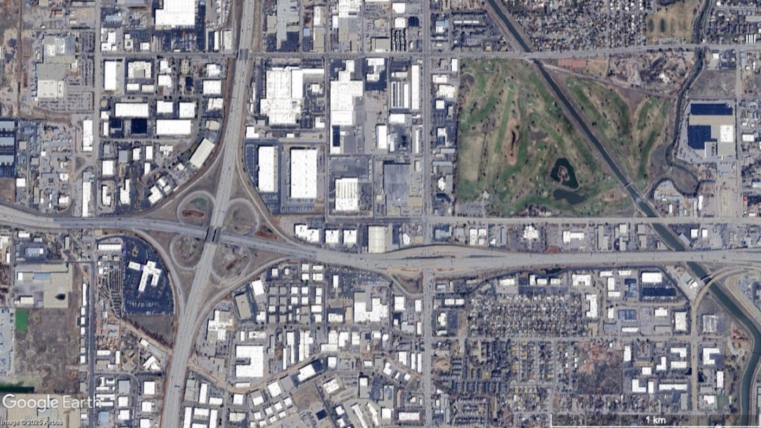
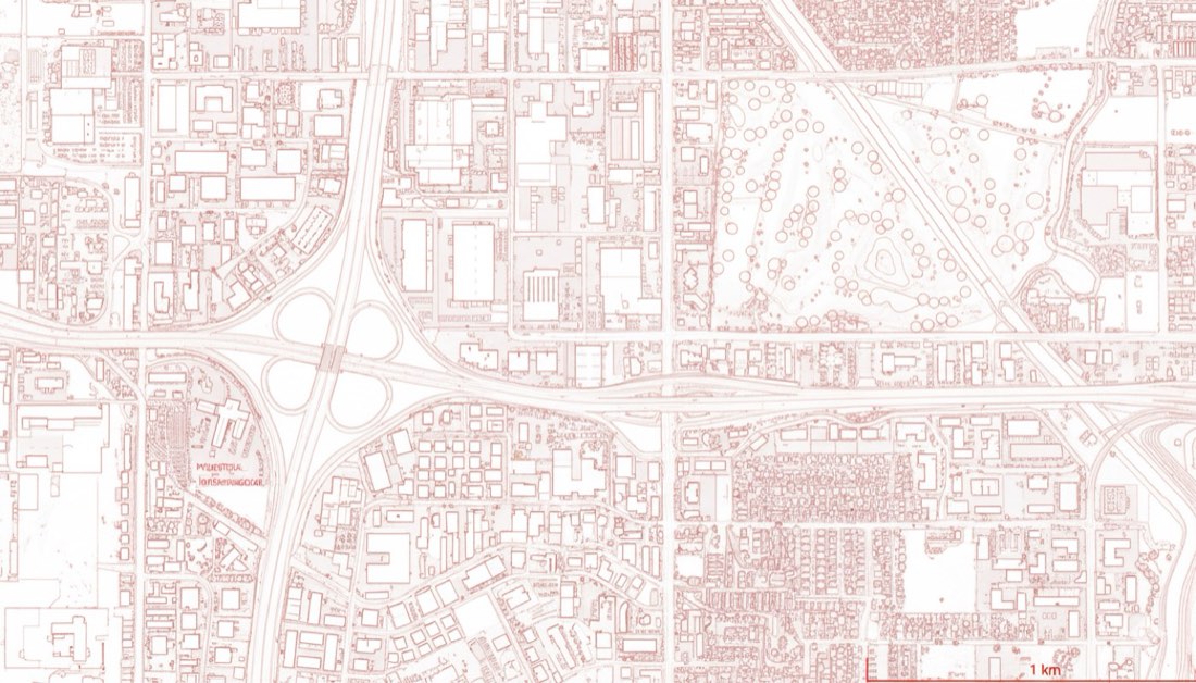
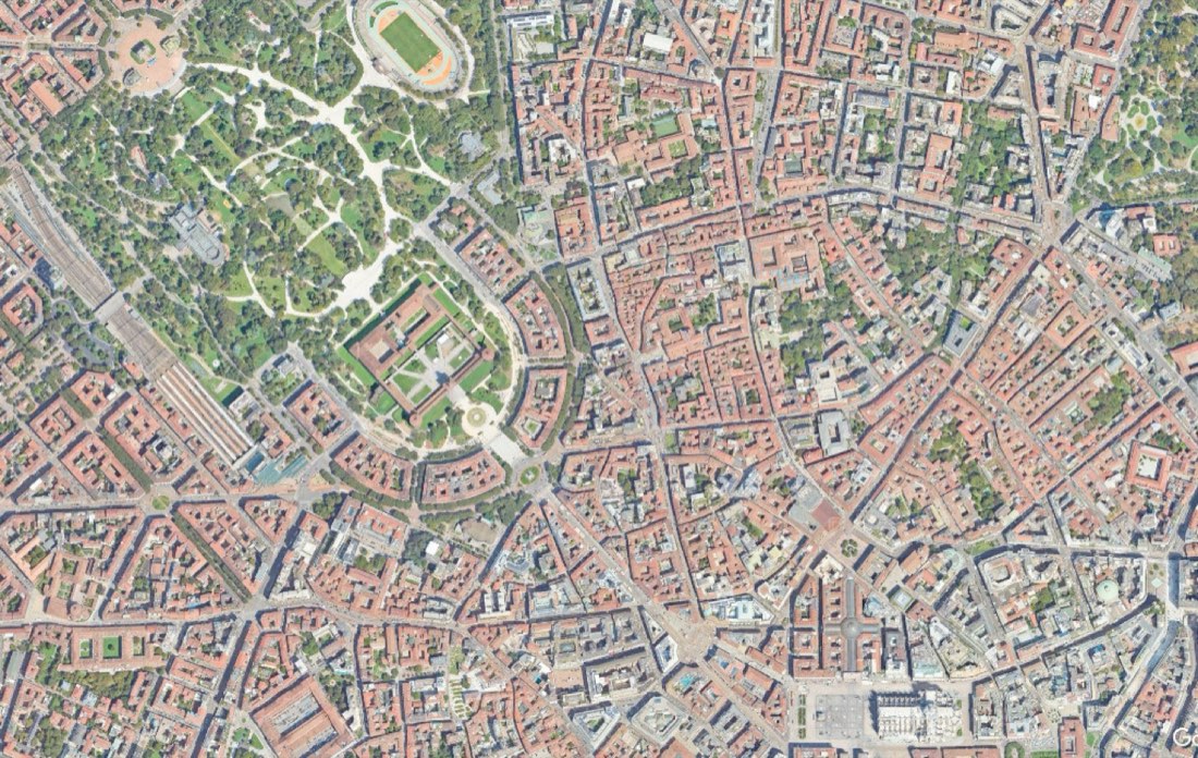
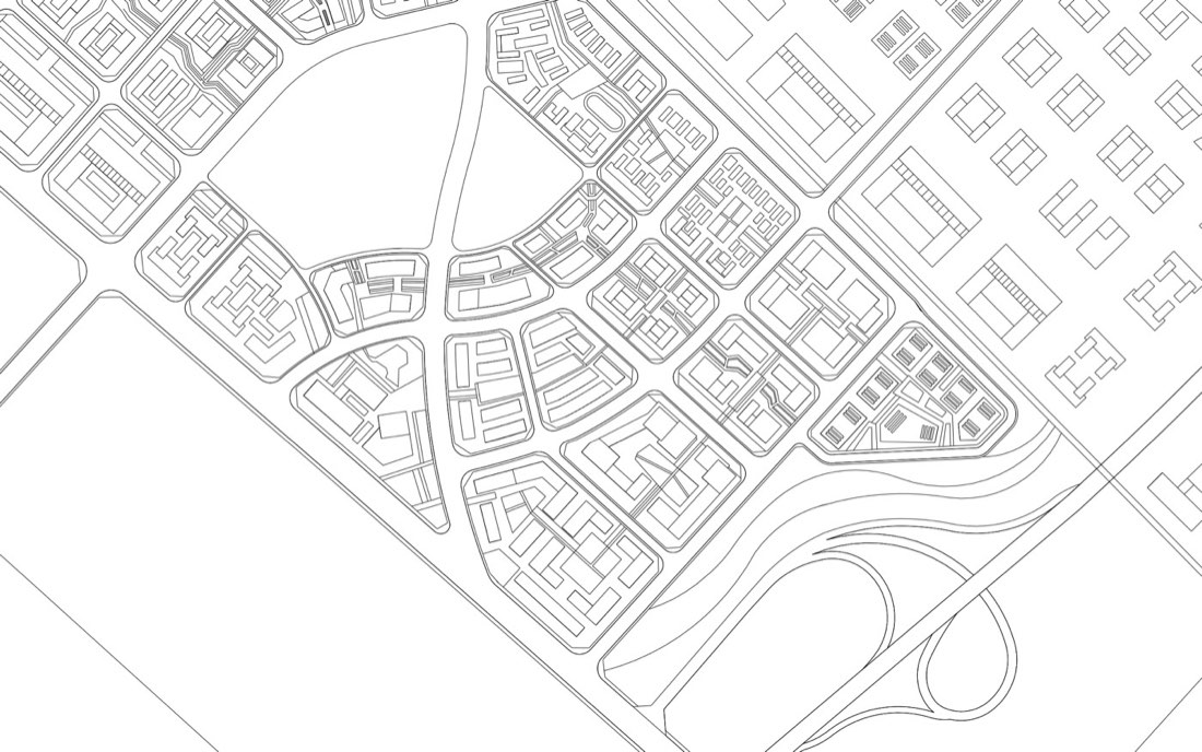
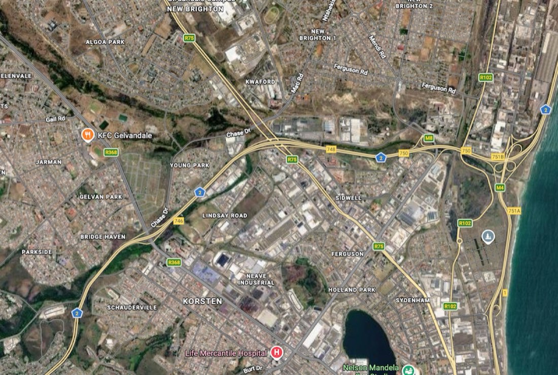
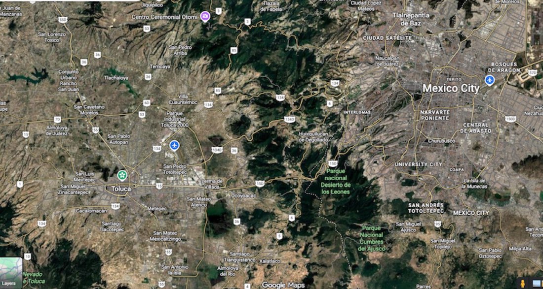
Based on the provided satellite image, generate a stylized and accurate outline map. Represent buildings as solid dark or black shapes with clean edges, roads as thin white lines or paths, and green areas (parks, lawns, vegetation) as solid green color blocks. Maintain realistic scale and proportions, and preserve the layout and spatial relationships from the satellite image. The overall composition should be minimal, clean, and suitable for urban or architectural site analysis — top-down view, flat graphic style, high contrast, and presentation-ready.
NEXT STEP:
✦ Before → After4 examplesExample 01 · FreeOpen lesson →
Example 01
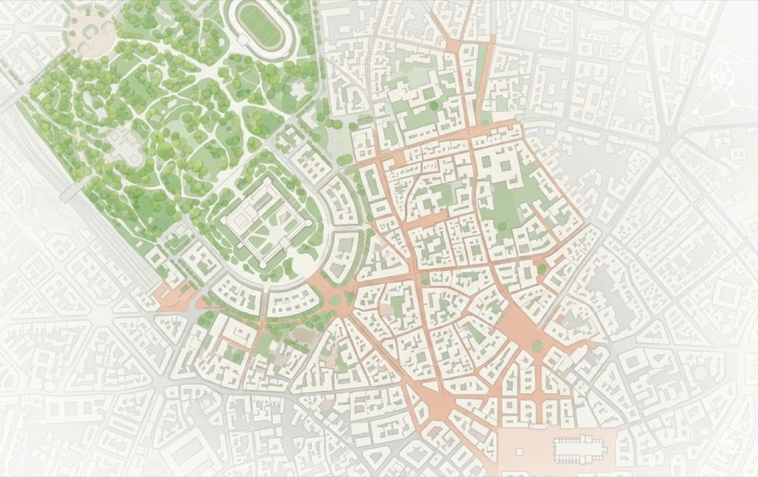
InputNano Banana
Input → Nano Banana → ChatGPT
Prompt · Free prompt
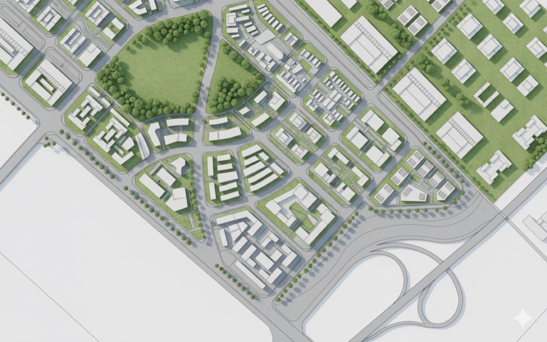
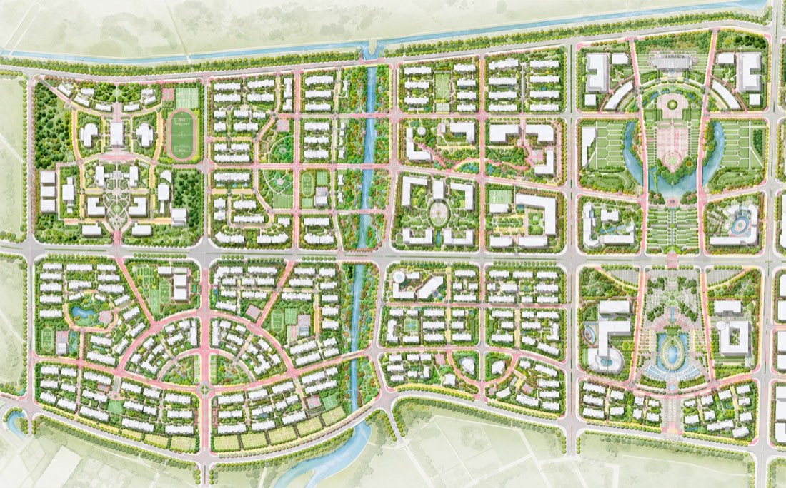
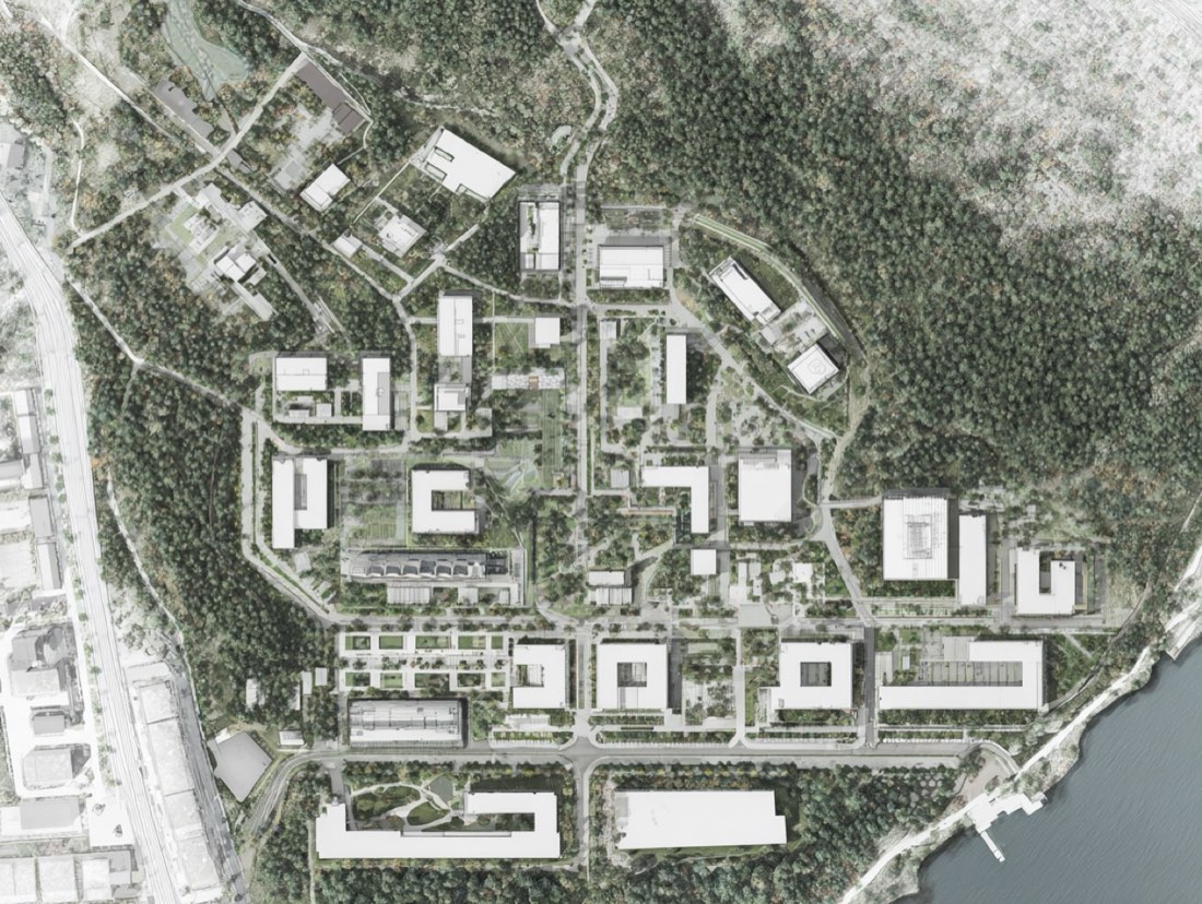
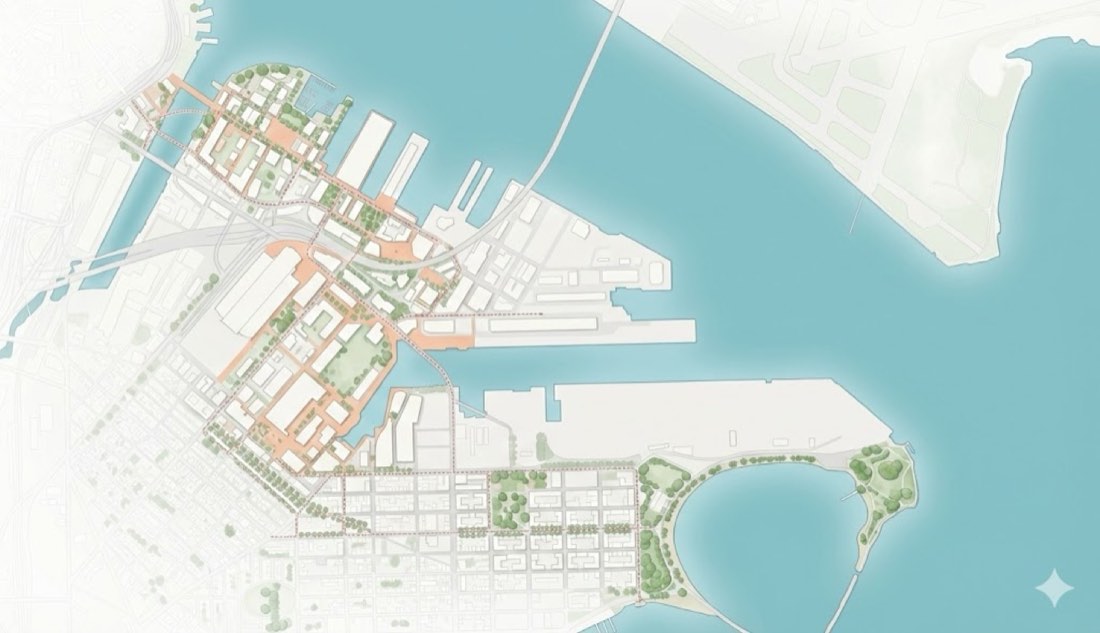
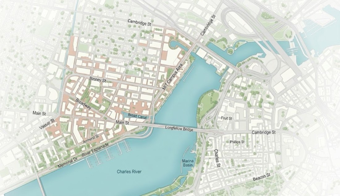
Render the urban master plan in a clean top-down view. Fill open space areas with realistic grass textures, and add groups of top-view tree canopies for parks and plazas. Place street trees consistently along sidewalks and boulevards. Use a balanced color palette with soft greens for vegetation, light grays for paving, and realistic building rooftops. Maintain accurate scale and spatial layout, and apply soft natural daylight with subtle shadows for depth. The final plan should feel cohesive, professional, and presentation-ready — suitable for urban design portfolios or competition boards.Buildings should have flat white or light-colored rooftops with subtle outlines and shadows.
✦ Before → After2 examplesExample 01 · FreeOpen lesson →
Example 01
BeforeAfter
Plan to Birdseye
Prompt · Free prompt
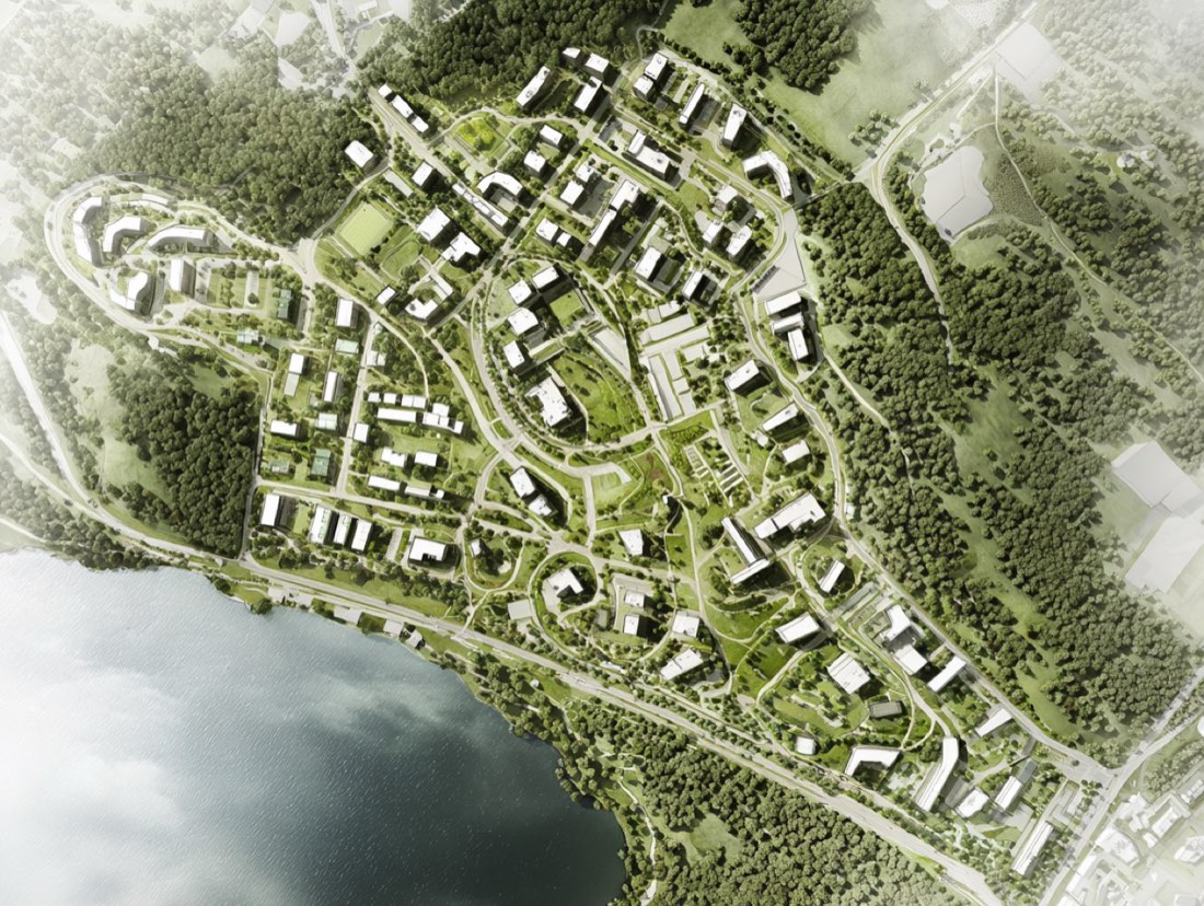
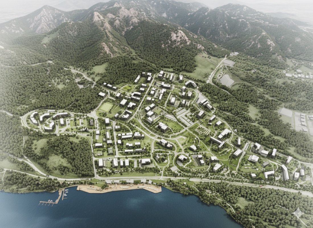
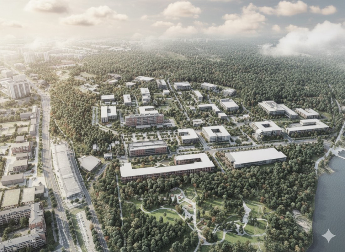
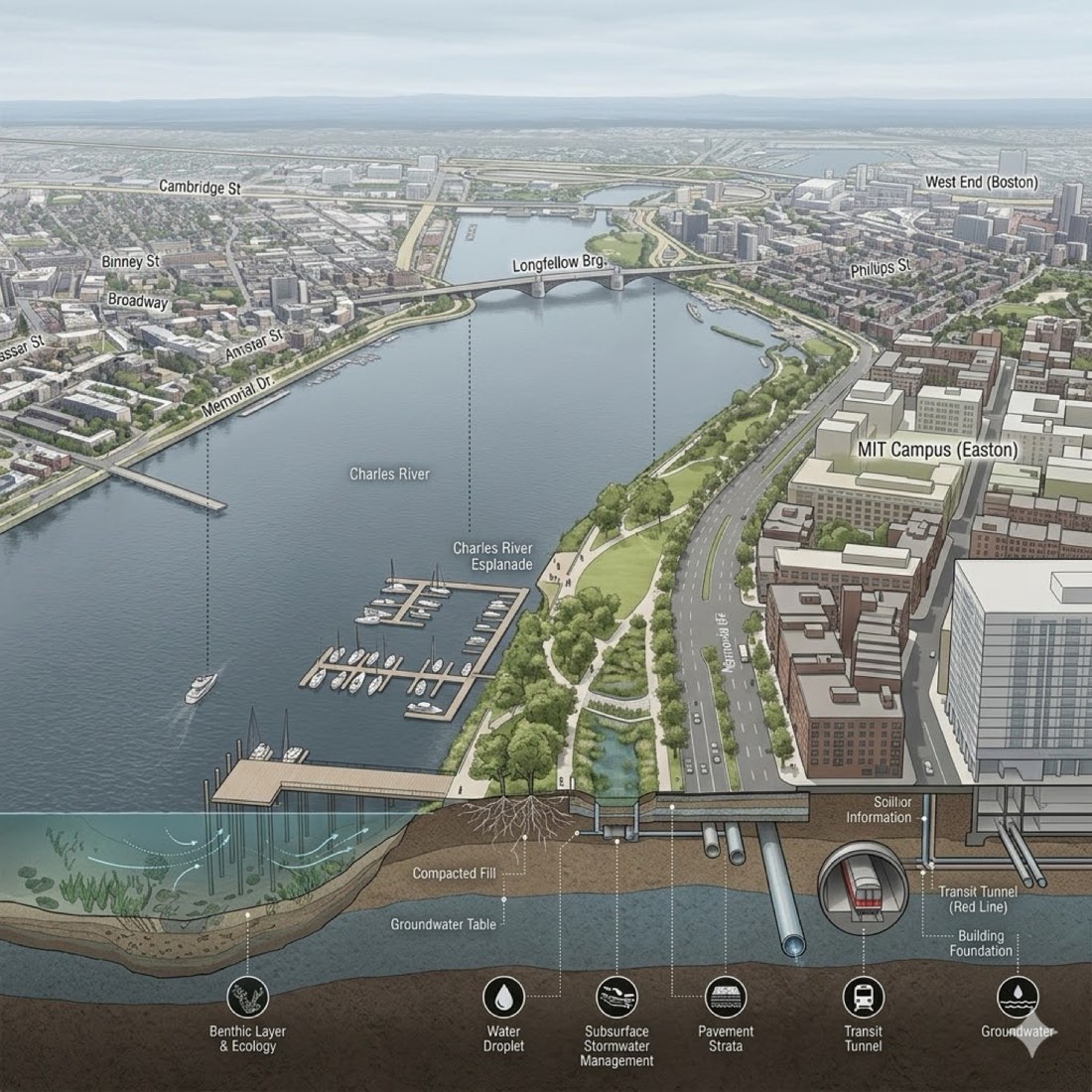
Convert this urban development masterplan, situated along the coastline and extending to the edge of a mountainous area, into a detailed bird’s-eye view rendering. The perspective should look inland — from the water toward the top of the mountain — gradually revealing the transition from coastal development to hillside structures. Accurately model the natural topography, showing the sloping landform rising from sea level to elevated terrain. Extrude all buildings in 3D with appropriate massing and materials, clearly distinguishing between coastal, mid-slope, and mountain-edge zones. Apply realistic textures for rooftops, roads, plazas, and green spaces. Include waterfront promenades, urban blocks, vegetation, and public spaces throughout the site. Use soft natural daylight and atmospheric depth to enhance realism. The final rendering should showcase how the urban design responds to the site's terrain — visually connecting the coastline, urban grid, and mountainous backdrop in a cohesive and professional composition.
*Note: You might need to try a few times to get a result you’re fully satisfied with.
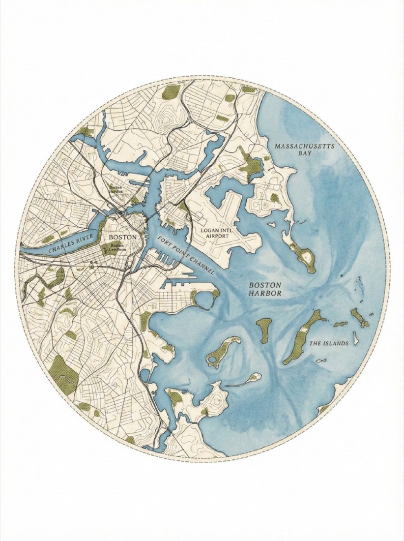
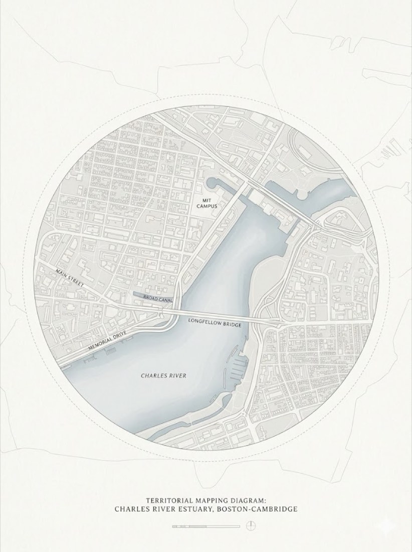
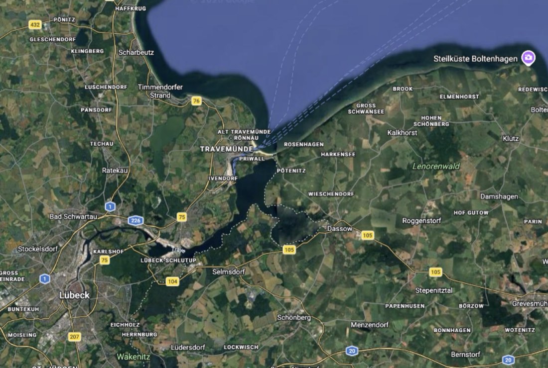
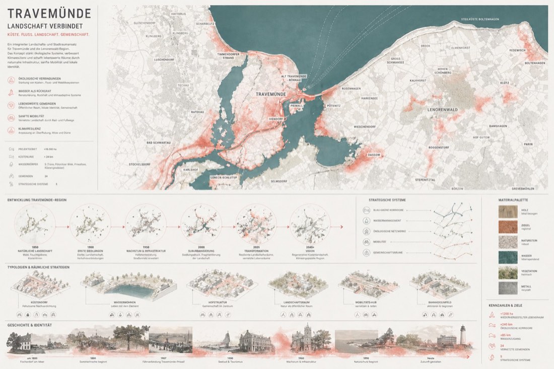
A circular architectural site plan of the Boston coastline and harbor, aerial view. The map is contained within a perfect circle with a faint dashed border line. Style of a minimalist topographic map on textured beige archival paper. Deep slate-teal color for the water with a grainy watercolor wash texture. Cream-colored land with delicate, fine-line ink contour lines representing elevation. Small, textured patches of olive-green stippling to represent parks and greenery. Clean, vintage cartographic aesthetic, high detail, minimal labels, white background surrounding the circle. Ratio 3:4
*Note: Change the location, colors as neede.
✦ Before → After7 examplesExample 01 · FreeOpen lesson →
Example 01
ChatGPT Mapping
Prompt · Free prompt
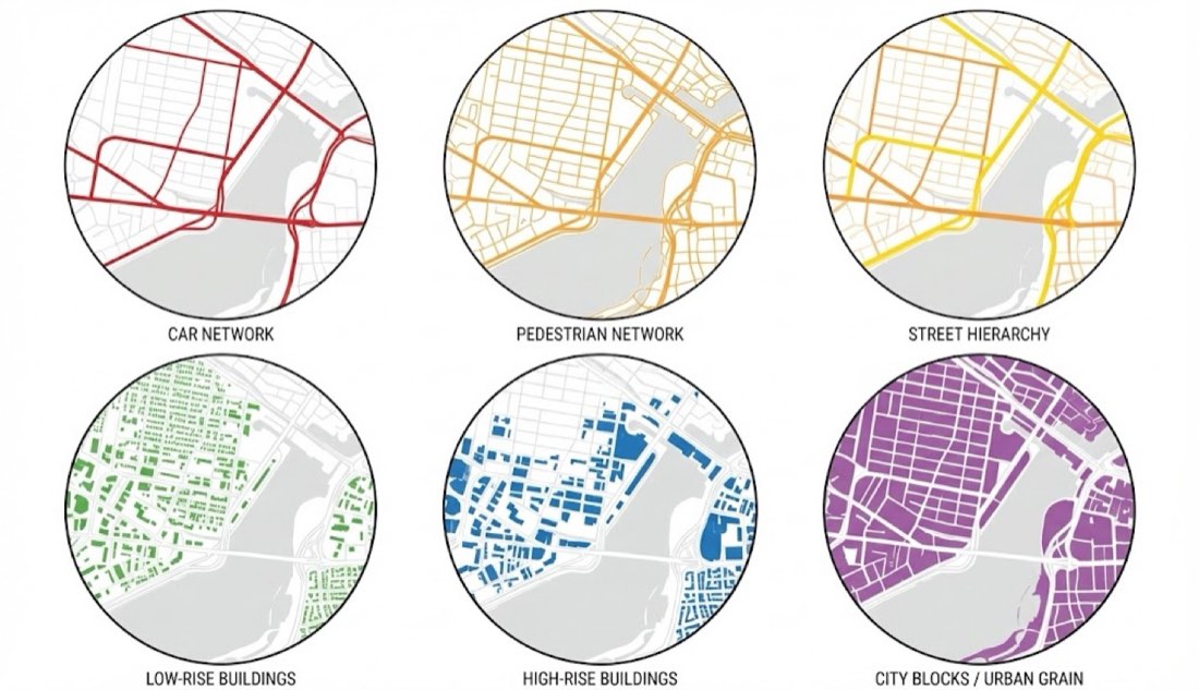
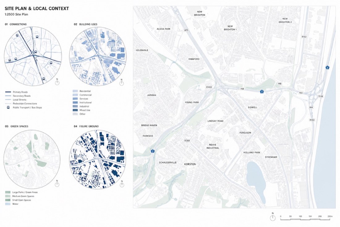
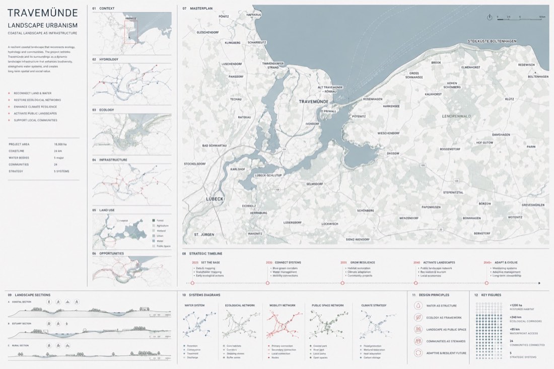
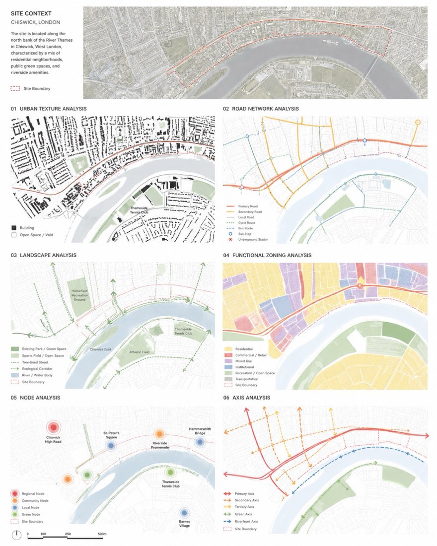
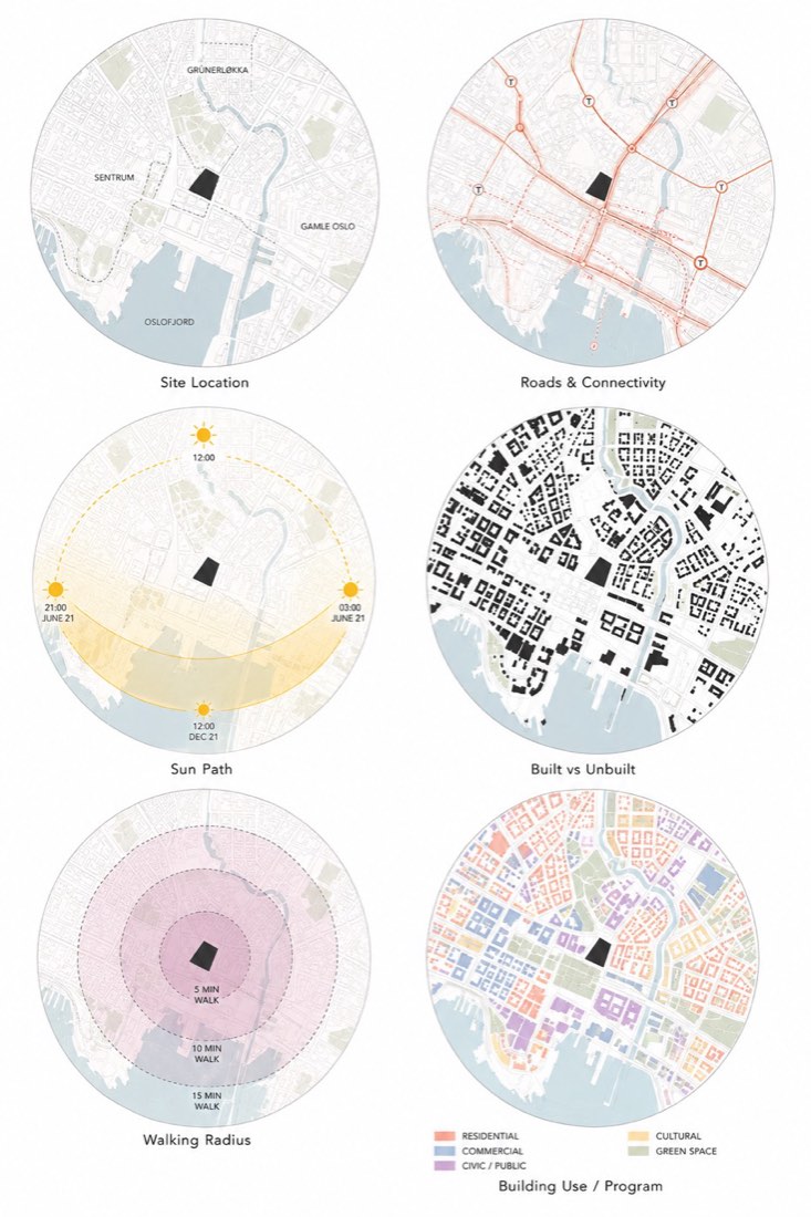
Transform my uploaded site plan / urban context map into a professional architectural SITE PLAN & LOCAL CONTEXT analysis board in the same graphic language as the reference.
IMPORTANT — PRESERVE THE REAL SITE:
Treat my uploaded plan as the fixed geographic base.
Preserve exactly:
- site boundary
- street network
- building footprints
- block structure
- existing open spaces
- major infrastructure
- orientation
- surrounding urban fabric
- relative scale and proportions
Do not redesign the site.
Do not invent roads, buildings, blocks, or landscape features.
Do not distort the original geography.
BOARD LAYOUT:
Create a clean landscape-format architectural analysis board on a pure white background.
Use an asymmetrical editorial composition:
LEFT SIDE — approximately 35–40% of the board
Create four small analytical diagrams arranged in a clean 2 × 2 grid.
RIGHT SIDE — approximately 60–65% of the board
Create one large detailed contextual site plan.
Maintain generous white negative space between all diagrams.
MAIN TITLE:
Place a small bold title in the upper-left:
SITE PLAN & LOCAL CONTEXT:
BELOW IT, ADD A SMALL SUBTITLE:
1:2500 SITE PLAN:
Use compact architectural sans-serif typography.
01 — CONNECTIONS:
Create a circular analytical map derived from the actual site plan.
Show:
- primary roads
- secondary roads
- pedestrian connections
- public transport / bus stops where applicable
- important movement routes
- relationship between the site and surrounding street network
Use different line weights rather than excessive colors.
Primary routes:
dark desaturated navy-blue.
SECONDARY ROUTES:
MEDIUM MUTED BLUE.:
LOCAL CONTEXT:
VERY PALE BLUE-GREY.:
Keep the diagram minimal and diagrammatic.
02 — BUILDING USES:
Create a second circular analytical map using the same geographic extent.
Classify surrounding buildings by program where information is available, such as:
- residential
- commercial
- services
- institutional
- mixed use
- other relevant categories
Represent each category using a restrained monochromatic blue palette.
DO NOT USE RAINBOW COLORS.:
Keep streets and background context extremely pale so the building-use information is dominant.
03 — GREEN SPACES:
Categorize green spaces according to aerial photo.
Use progressively darker shades of the same blue family.
large park = pale green.
small open space = dark navy-green.
Maintain exact footprints from the source map.
04 — FIGURE GROUND:
Create a simplified architectural figure-ground diagram.
Remove unnecessary contextual information.
SHOW ONLY:
BUILDINGS:
solid dark desaturated navy-blue.
GROUND / STREETS / OPEN SPACE:
pure white.
Preserve the exact real building footprints and urban morphology.
This diagram should be extremely clean and abstract.
MAIN CONTEXTUAL SITE PLAN:
On the right side, create a much larger detailed site plan showing the complete local urban context.
Use precise architectural / GIS-style linework.
Existing surrounding buildings:
very pale grey-blue outlines with subtle transparent fills.
ROADS:
PALE COOL GREY.:
MINOR STREETS:
EXTREMELY LIGHT GREY.:
Landscape / open space:
very pale desaturated blue-green or grey-green.
WATER, IF PRESENT:
VERY PALE MUTED BLUE.:
The site should be clearly visible without becoming a large saturated graphic shape.
Use subtle transparent blue overlays to identify important local relationships.
Add only a few carefully selected analytical lines where useful.
Do not overcrowd the main map with arrows, icons, labels, or graphic effects.
COLOR PALETTE:
Use a tightly controlled monochromatic architectural palette.
SUGGESTED COLORS:
DARK NAVY
#174B63:
DEEP BLUE
#2F6B86:
MEDIUM BLUE
#6F9EB6:
SOFT BLUE
#AFC9D6:
PALE BLUE
#DCE8ED:
VERY PALE BLUE-GREY
#EEF3F4:
CONTEXT GREY
#D9DDDD:
WHITE
#FFFFFF:
OPTIONAL MUTED LANDSCAPE TONE:
#DDE8E2:
Use approximately 80–90% white / pale grey context and only 10–20% stronger blue information.
Do not introduce additional saturated colors.
GRAPHIC LANGUAGE:
The final result should resemble a professionally prepared architecture / urban design analysis board created using:
CAD + GIS + ILLUSTRATOR + INDESIGN.:
CHARACTERISTICS:
- precise vector-like linework
- thin grey contextual lines
- flat color fills
- restrained transparency
- consistent blue palette
- clean circular analytical diagrams
- strong information hierarchy
- generous white space
- small architectural typography
- minimal legends
- subtle north arrows
- professional competition-board aesthetic
VERY IMPORTANT — AVOID AI LOOK:
Do NOT use:
- gradients
- glowing edges
- watercolor textures
- painterly effects
- 3D buildings
- perspective
- realistic trees
- decorative shadows
- random blue patches
- excessive transparency effects
- artificial texture
- blurred boundaries
- thick outlines
- oversized icons
- unnecessary arrows
- invented urban information
All colors should appear as clean, controlled, mostly FLAT vector fills.
The image should look manually constructed in Illustrator / InDesign from accurate CAD or GIS data, NOT generated by AI.
FINAL OUTPUT:
Strict orthographic top-down representation.
LANDSCAPE ORIENTATION.:
One large contextual site plan + four smaller analytical diagrams.
PURE WHITE BACKGROUND.:
Precise, minimal, highly legible architectural graphic design.
The uploaded site geometry must remain accurate throughout all five diagrams.
✦ Before → After1 examplesExample 01 · FreeOpen lesson →
Example 01
BeforeAfter
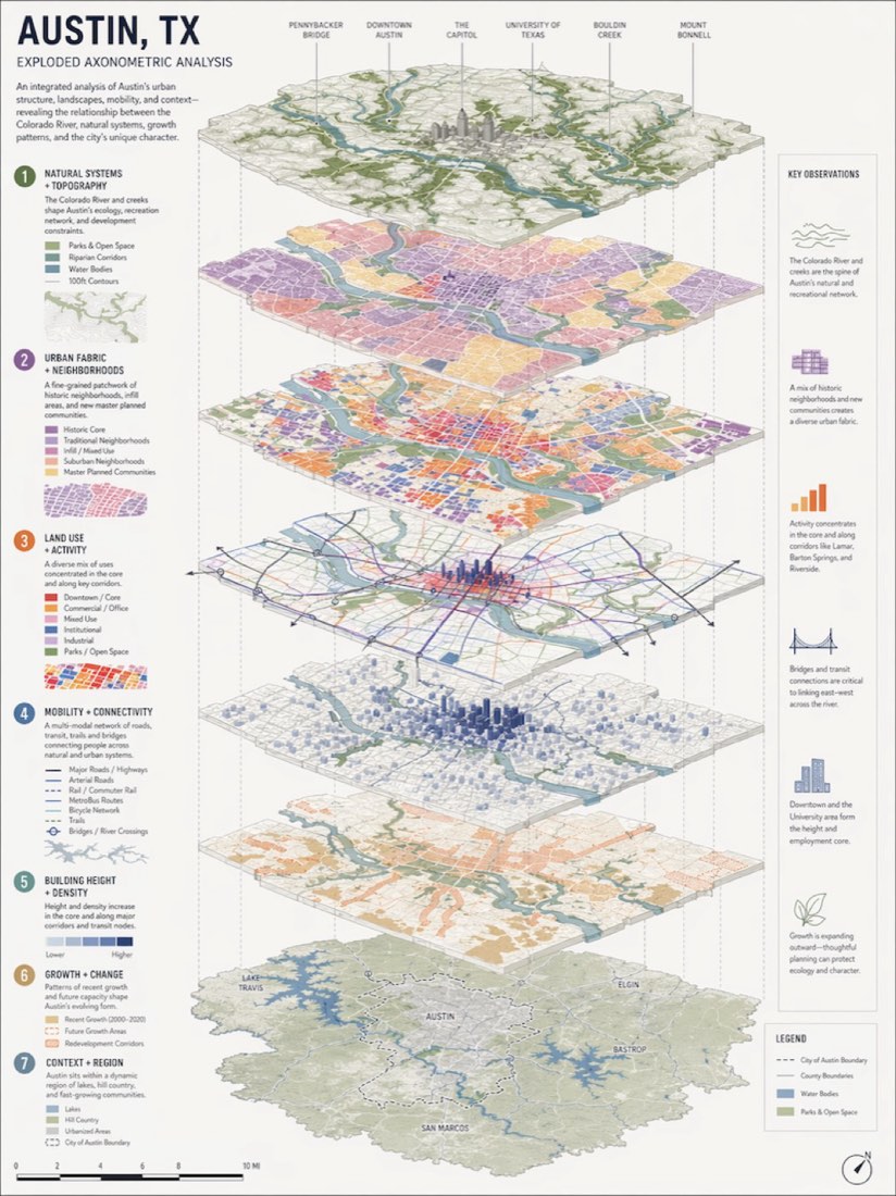
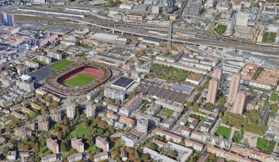
Aerial Photo to 3D Diagram
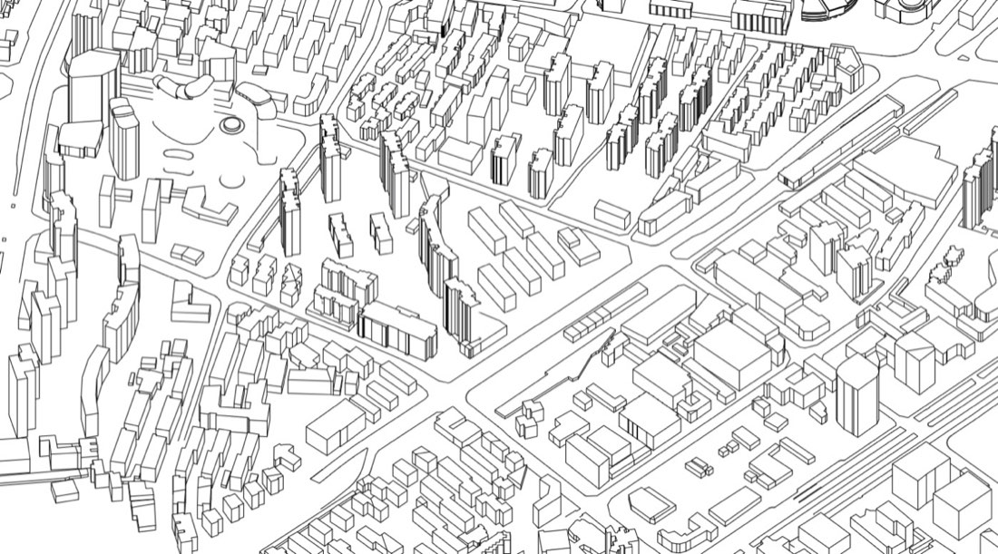
Prompt · Free prompt
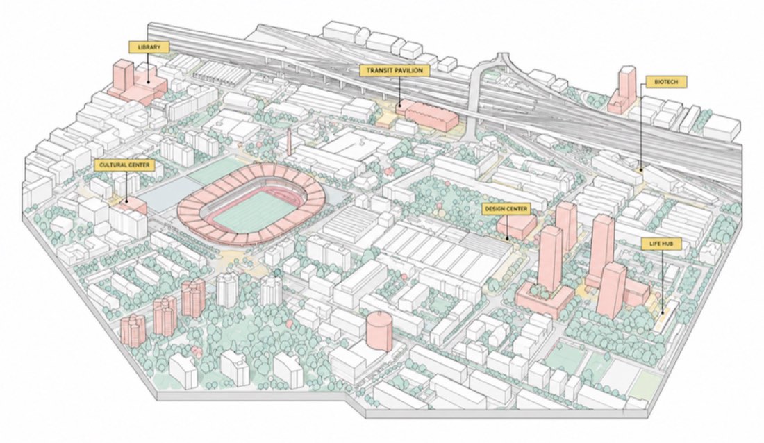
Transform my uploaded site plan into a refined architectural axonometric illustration while preserving the original site layout, building footprints, landscape, circulation, and spatial relationships exactly.
STYLE:
Create a premium architectural publication-style diagram using a floating axonometric site model. The visual language should resemble a professionally illustrated Adobe Illustrator architectural drawing with crisp vector linework, flat colors, precise geometry, and a clean editorial aesthetic.
COMPOSITION:
Represent the project as a single floating site block viewed from a 45° axonometric perspective.
Isolate the model on a pure white background with generous negative space.
Maintain the exact site geometry, scale, and proportions.
KEEP ALL ANNOTATIONS OUTSIDE THE MODEL.:
⸻:
BUILDINGS:
Render every building as simplified architectural masses with flat vector surfaces.
Use white and very light neutral gray for the majority of buildings.
Highlight major buildings, landmark structures, and primary interventions using a warm blush palette:
• Soft Blush Pink #F3C1BF Warm Coral #E89F95
Distribute the warm colors selectively to establish a clear architectural hierarchy without overwhelming the composition.
Draw every building with bold, crisp black vector outlines of consistent stroke weight, similar to professional Adobe Illustrator architectural drawings.
Building edges must be perfectly straight, sharp, and geometric.
Remove all façade details, windows, roof textures, and realistic materials while preserving the exact building footprints and heights.
LABELS:
Professional planning callouts. Lable with icons, building in pink with thicker black outline
STYLE:
yellow rectangular labels
black uppercase text
leader pointers
consistent typography
evenly distributed
EXAMPLES:
LIBRARY
CULTURAL CENTER
BIOTECH
DESIGN CENTER
TRANSIT PAVILION
LIFE HUB⸻
STREETS & HARDSCAPE:
Render roads, plazas, pavements, and pathways using clean flat vector graphics.
Clearly define every street edge with crisp black outlines.
Use subtle tonal differences between primary and secondary streets while maintaining a restrained monochromatic appearance.
Avoid gradients, watercolor textures, or soft painterly effects.
⸻:
LANDSCAPE:
Render parks and open spaces with flat vector fills using muted natural colors:
• Soft Sage #CBDDD6 Light Gray-Green #D9E1DF Mist Blue #BAD8DE
Use Warm Sand #FBD28C sparingly for plazas, civic spaces, or important public gathering areas.
Keep all landscape surfaces clean, geometric, and highly legible.
⸻:
VEGETATION:
Represent trees as small architectural symbols with flat circular canopies.
USE PRIMARILY:
• Soft Sage #CBDDD6 Mist Blue #BAD8DE
Introduce occasional Blush Pink #F3C1BF trees to subtly reinforce important public spaces and visual focal points.
Maintain consistent size, spacing, and graphic style throughout.
⸻:
GRAPHICS:
Overlay the drawing with restrained architectural infographic elements including:
thin black leader lines
numbered callouts
location pins
simple circular icons
minimal sans-serif typography
subtle architectural overlays
Use Blush Pink #F3C1BF and Warm Coral #E89F95 only as accent colors for highlighted routes, key buildings, important nodes, or primary interventions.
Maintain generous spacing and avoid visual clutter.
⸻:
LINEWORK:
PRIORITIZE CRISP ARCHITECTURAL DRAFTING.:
Use consistent black vector strokes throughout the illustration.
Building outlines should be noticeably heavier than all secondary graphics.
Road edges, landscape boundaries, and annotations should use thinner strokes to establish a clear hierarchy.
Every line should appear perfectly straight and precise, as if drawn in Adobe Illustrator.
⸻:
COLOR PALETTE:
USE ONLY THE FOLLOWING COLORS:
* White — #FFFFFF
* Light Neutral Gray
* Warm Sand — #FBD28C
* Soft Sage — #CBDDD6
* Light Gray-Green — #D9E1DF
* Mist Blue — #BAD8DE
* Blush Pink — #F3C1BF
* Warm Coral — #E89F95
* Black — #000000 (linework only)
Keep all colors soft, flat, and low in saturation with a bright editorial appearance.
⸻:
LIGHTING:
Use soft ambient daylight with almost no visible shadows.
Apply only subtle ambient occlusion to separate architectural volumes while maintaining a flat diagrammatic quality.
✦ Before → After1 examplesExample 01 · FreeOpen lesson →
Example 01
BeforeAfter
Model to Urban Diagram
Prompt · Free prompt
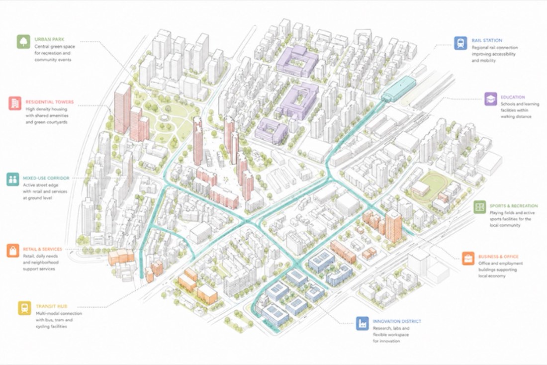
Transform my uploaded architecture, landscape architecture, campus plan, or masterplan into a clean professional axonometric program diagram in the same visual language as the reference image.
PRESERVE THE DESIGN:
Keep the uploaded design spatially accurate.
PRESERVE EXACTLY:
• building footprints
• building locations
• relative building heights
• roads and paths
• landscape layout
• open spaces
• existing buildings
• trees and planting areas
• site boundaries
• circulation structure
• overall scale and proportions
Do not redesign the project or invent new buildings.
AXONOMETRIC VIEW:
Convert the plan into a precise architectural axonometric / isometric view.
Use a moderately elevated viewing angle so the entire site is clearly visible.
Maintain realistic building scale and proportions. Do not exaggerate building heights or distort the site.
BASE GRAPHIC STYLE:
Create a very light, clean architectural diagram on a pure white background.
THE OVERALL APPEARANCE SHOULD COMBINE:
• architectural axonometric drawing
• fine vector linework
• simplified 3D massing
• subtle landscape illustration
• pastel program coding
• minimalist competition-board graphics
The image should feel primarily vector-based rather than rendered.
BUILDINGS:
Represent most buildings as simple white architectural masses with extremely thin light-gray outlines.
USE:
• white façades
• white roofs
• very subtle gray shading
• minimal or no façade details
• crisp edges
• extremely soft ambient shadows
Do not make the buildings photorealistic.
PROGRAM HIGHLIGHTS:
Selectively highlight important buildings or program areas using soft pastel colors.
SUGGESTED PALETTE:
• muted coral / salmon
• dusty pink
• pale turquoise
• muted blue
• sage green
• pale orange
• warm beige
• soft yellow
Apply color only to important program elements.
Keep approximately 70–80% of the architecture white or extremely pale so highlighted programs immediately stand out.
Use flat or nearly flat color. Avoid strong gradients.
LANDSCAPE:
RENDER THE LANDSCAPE VERY LIGHTLY.:
USE:
• pale sage-green ground washes
• simplified tree symbols
• small individual tree canopies
• thin gray-green outlines
• very subtle planting masses
• faint lawn areas
• delicate water features
Trees should appear as simplified architectural landscape symbols rather than realistic trees.
Do not create dense photorealistic vegetation.
CIRCULATION:
Highlight the primary pedestrian or functional circulation network with a continuous pale turquoise or muted blue-green band.
Allow this circulation line to weave naturally between buildings and connect important program areas.
Secondary paths should remain very pale gray or white.
CONTEXT:
Fade the surrounding context significantly.
Existing buildings outside the primary intervention should appear as:
• white massing
• very pale gray outlines
• low contrast
• partially transparent-looking forms
The project site should remain visually dominant.
ANNOTATION SYSTEM:
Add clean program annotations around the perimeter of the axonometric drawing.
Connect each annotation to its corresponding building or landscape feature using thin dotted leader lines.
LEADER LINES SHOULD:
• be extremely thin
• use muted gray
• contain small regular dots
• avoid crossing unnecessarily
• terminate precisely at the corresponding program
Arrange labels around the outside of the site rather than covering the architecture.
ICONS:
Above important labels, use simple square program icons.
Icons should use the same pastel color coding as their associated programs.
Use minimalist white pictograms inside softly colored rounded squares.
POSSIBLE CATEGORIES:
• community
• education
• healthcare
• recreation
• workshop
• culture
• social space
• rehabilitation
• sports
• public services
• landscape
• mobility
Keep icons small, simple, consistent, and diagrammatic.
TYPOGRAPHY:
USE CLEAN MODERN SANS-SERIF TYPOGRAPHY.:
Program titles should be compact and easy to read.
Match label text colors to the associated program color where appropriate.
DO NOT USE OVERSIZED TYPOGRAPHY.:
GRAPHIC HIERARCHY:
THE VISUAL HIERARCHY SHOULD BE:
• highlighted program buildings
• primary circulation network
• white architectural massing
• landscape
• surrounding context
• dotted annotation system
Keep the overall drawing extremely light and airy.
COLOR + RENDERING CONTROL:
USE MOSTLY FLAT COLORS.:
AVOID AI-STYLE SMOOTH GRADIENTS.:
Avoid excessive shadows, glowing effects, atmospheric lighting, saturated colors, glossy materials, and photorealistic textures.
The diagram should look like it was carefully constructed in Rhino / SketchUp and finished manually in Adobe Illustrator.
FINAL STYLE:
Minimal architectural axonometric diagram, white background, precise building geometry, white massing, delicate gray outlines, pale green landscape, simplified trees, selective pastel program highlighting, turquoise circulation network, dotted annotation lines, minimalist program icons, generous negative space, clean Scandinavian / European architectural competition graphic style.
IMPORTANT:
Do not make the result look like an AI-generated illustration.
Prioritize:
precise geometry,
flat graphic colors,
consistent line weights,
clean edges,
restrained textures,
minimal shadows,
and strong information hierarchy.
✦ Before → After1 examplesExample 01 · FreeOpen lesson →
Example 01
BeforeAfter
Sketch to Urban Plan
Prompt · Free prompt
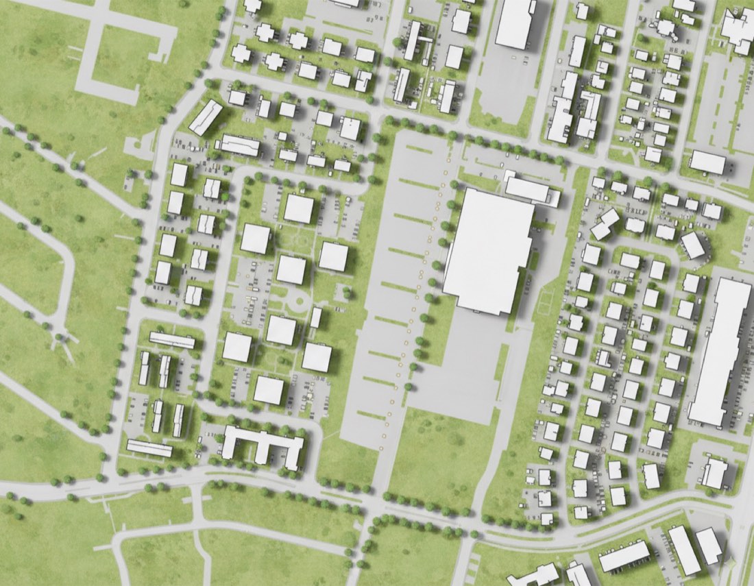
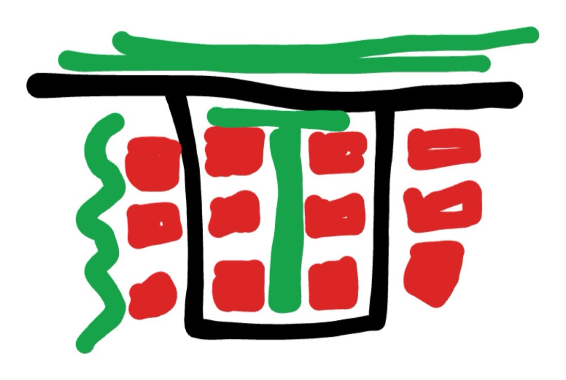
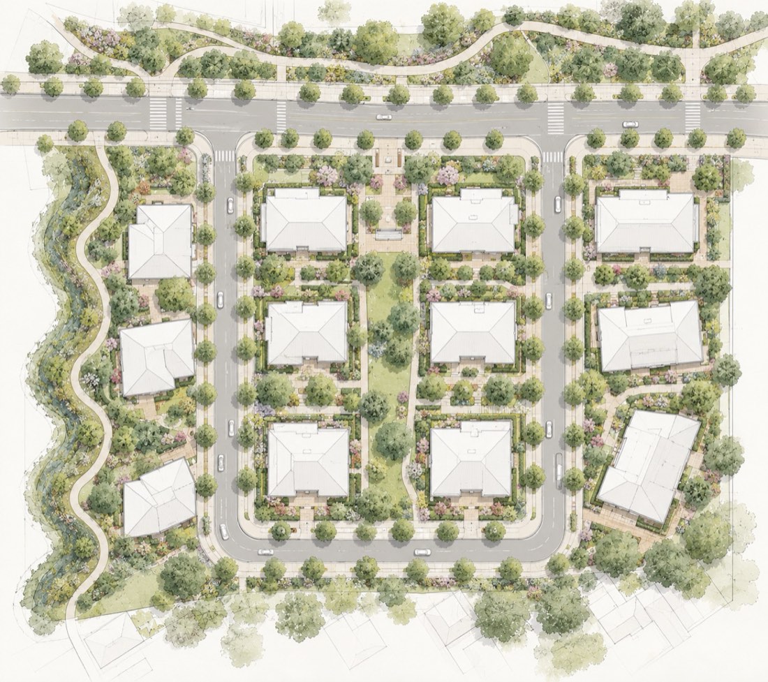
Transform my uploaded architecture or landscape site plan into a professional landscape architecture competition masterplan, combining precise CAD linework, delicate hand-drawn graphics, and subtle watercolor textures.
DESIGN & LAYOUT:
• Preserve the original site layout, building locations, circulation network, planting zones, and overall proportions.
• For rough sketches, refine geometry into clean, logical architectural forms without changing the original design intent.
• Ensure roads have consistent widths, smooth curves, realistic turning radii, and logical intersections.
• Maintain clear access to buildings and a well-connected pedestrian network.
• Use strictly orthographic top-down view, with no perspective or 3D effects.
BUILDINGS & ROADS:
• Buildings: clean white roof plans, crisp grey outlines, simple roof geometry, and extremely subtle shadows.
• Refine rough building shapes into organized, realistic footprints while preserving their positions and orientations.
• Roads: light warm-grey surfaces, precise edges, smooth connections, and consistent widths.
• Paths: pale beige-grey, narrower than roads, with clear and logical connections.
LANDSCAPE & TREES:
• Arrange trees in organized, intentional compositions rather than random distributions.
• Use consistent spacing along streets, natural clusters in planting beds, and balanced tree groupings around buildings.
• Tree symbols: simplified top-view crowns, slightly irregular shapes, fine outlines, semi-transparent sage-green fills, and minimal canopy details.
• Planting: soft olive and muted green washes, simplified shrub clusters, delicate stippling, and occasional dusty pink or lavender accents.
• Grass: pale yellow-green with minimal watercolor texture and generous open space.
VISUAL STYLE & COLORS:
Create a clean, minimalist architectural competition illustration.
• Muted, low-saturation palette: sage green, dusty olive, pale grey-green, warm beige, ivory, and light grey.
• White buildings should remain the clearest elements.
• Fine architectural linework with a clear hierarchy.
• Subtle watercolor and colored-pencil textures, without heavy pigments.
• Simplified, diagrammatic vegetation rather than photorealistic planting.
• Render the main site with greater detail; fade surrounding context into pale, minimal outlines.
• Maintain a light off-white background and balanced negative space.
FINAL RESULT:
Elegant, precise, organized, and competition-quality. organized trees, clean outlines for building. logistic road layout
Avoid photorealism, oversaturated colors, random trees, excessive planting detail, thick black outlines, distorted buildings, inconsistent road widths, awkward intersections, heavy shadows, and unnecessary design changes.
Maintain the original image aspect ratio and overall composition.
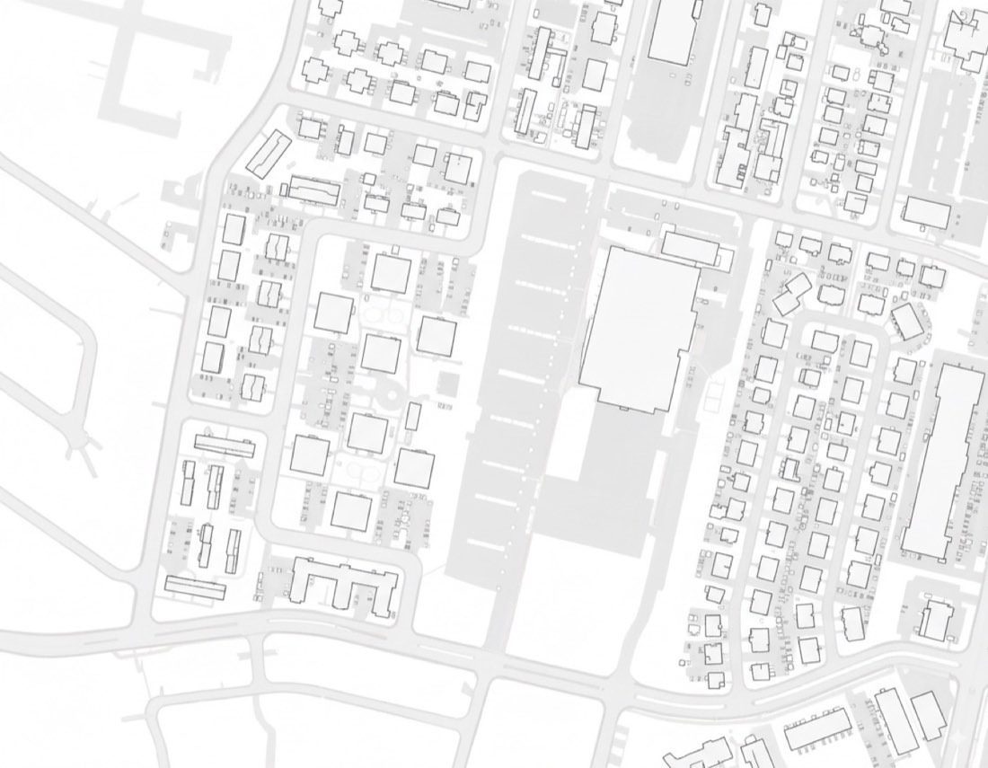
 BeforeNano Banana (ChatGPT failed)