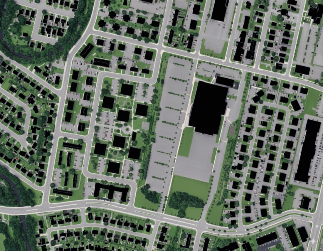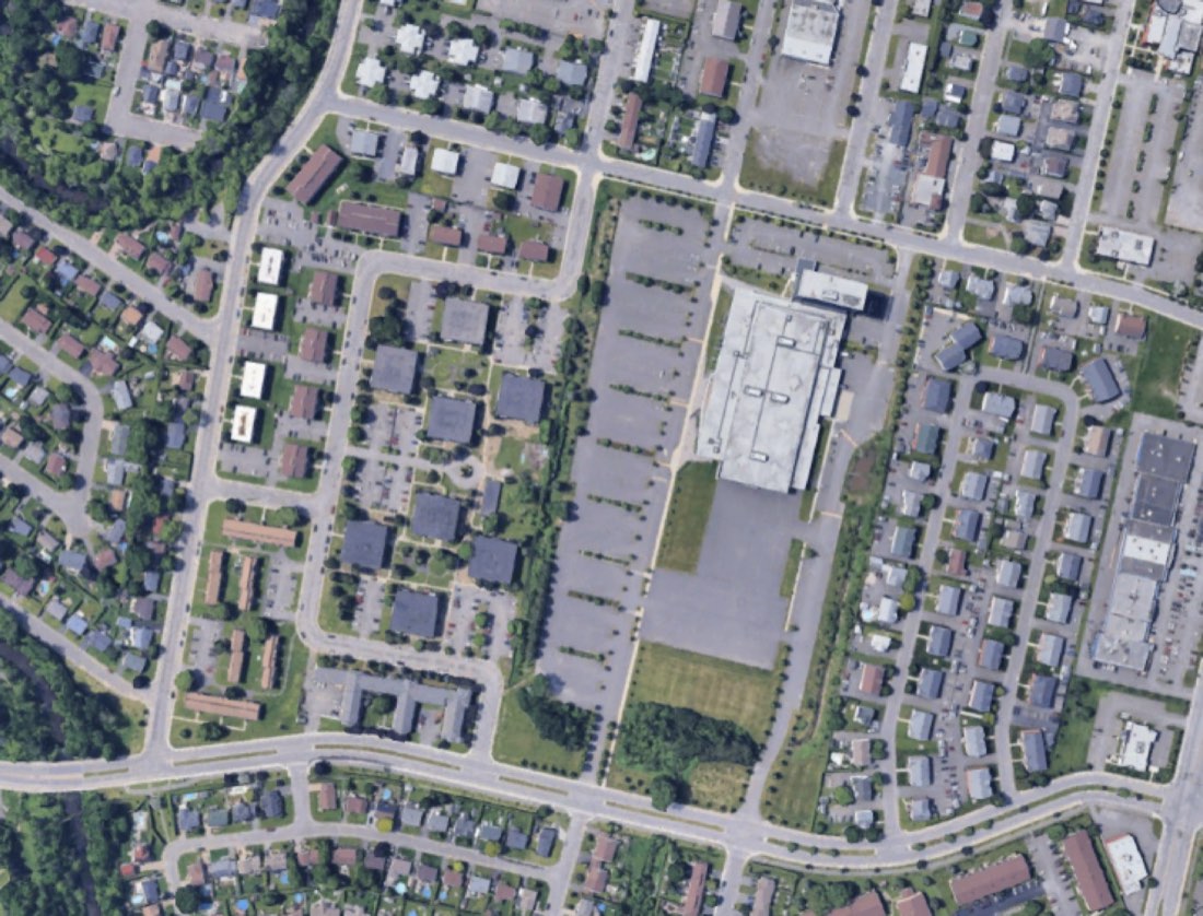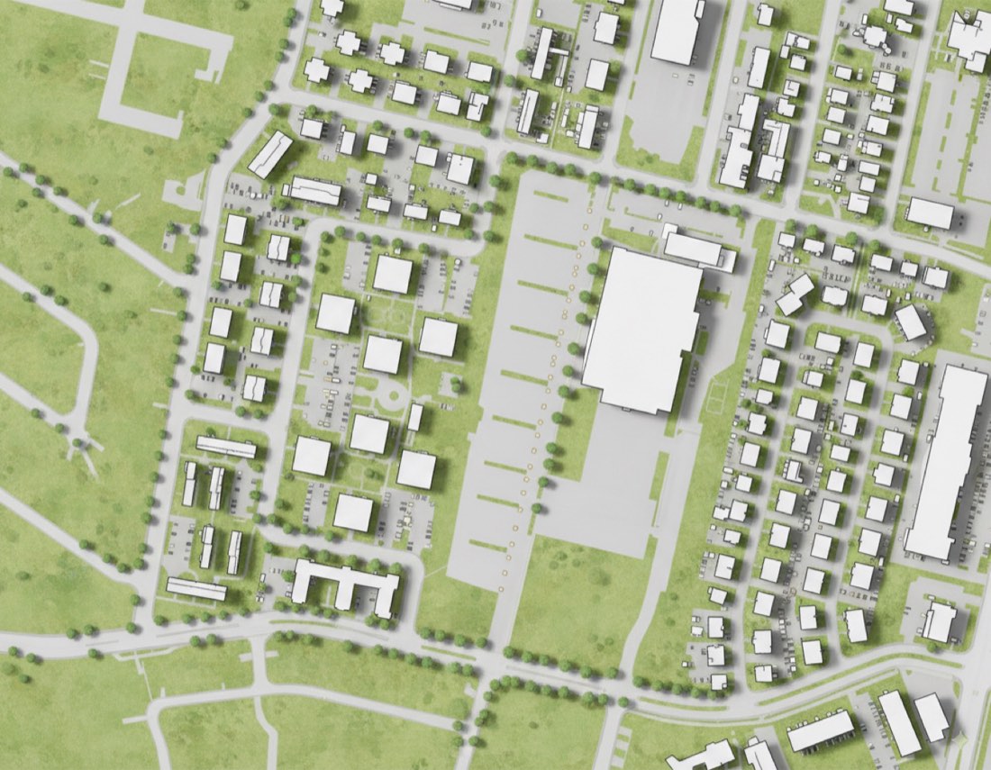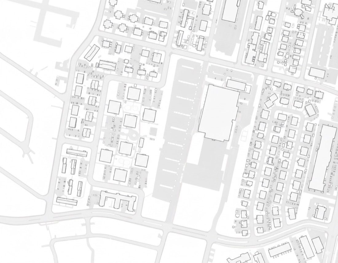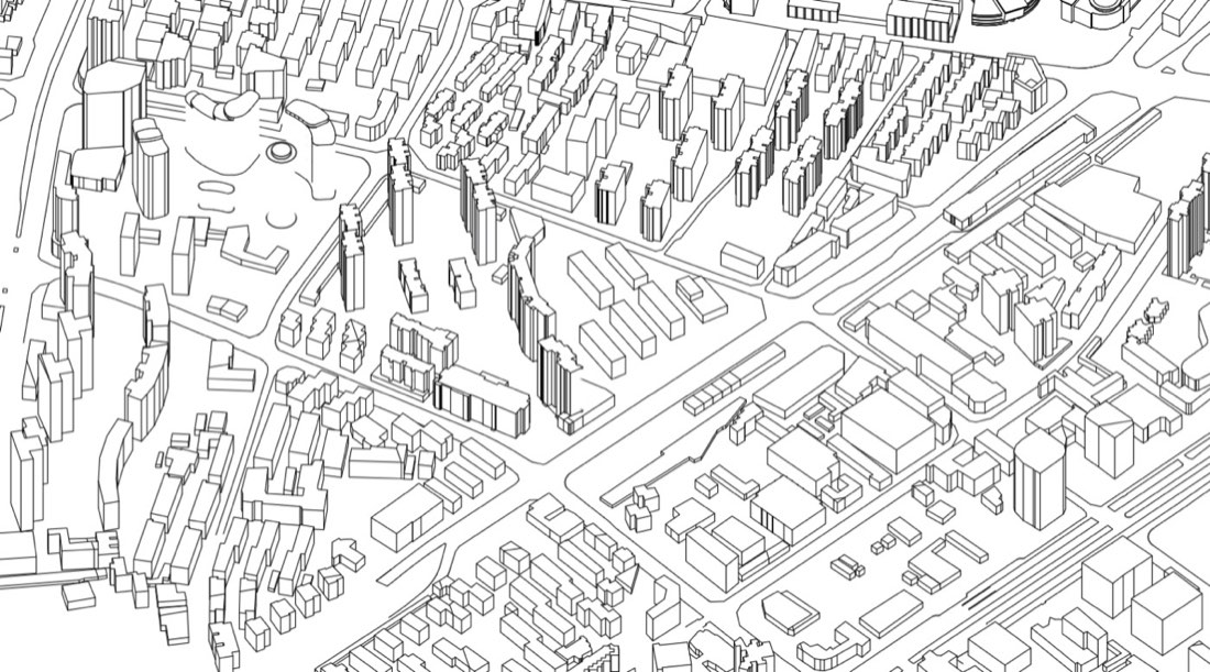
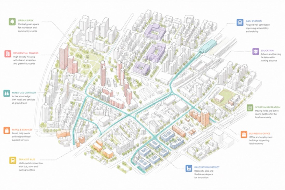
 原图结果
模型转城市分析图
把我上传的建筑、景观设计、校园规划或总体规划,转换为一张干净专业的轴测功能分析图,采用与参考图相同的视觉语言。 保留设计: 保持上传设计的空间准确性。 完全保留: • 建筑轮廓 • 建筑位置 • 建筑的相对高度 • 道路和步道 • 景观布局 • 开放空间 • 现状建筑 • 树木和种植区 • 场地边界 • 流线结构 • 整体尺度和比例 不要重新设计项目或虚构新建筑。 轴测视图: 把平面转换为精确的建筑轴测/等轴测视图。 使用适度升高的视角,让整个场地清晰可见。 保持真实的建筑尺度和比例。不要夸大建筑高度或扭曲场地。 基础图示风格: 在纯白背景上制作一张非常轻盈、干净的建筑分析图。 整体效果应结合: • 建筑轴测图 • 精细的矢量线条 • 简化的 3D 体量 • 淡淡的景观插画 • 粉彩色功能编码 • 极简的竞赛展板图示 图像应以矢量为主,而不是渲染出来的。 建筑: 大多数建筑表现为简单的白色建筑体块,配极细的浅灰色轮廓。 使用: • 白色立面 • 白色屋顶 • 非常细微的灰色明暗 • 极少或没有立面细节 • 清晰的边缘 • 极其柔和的环境阴影 不要把建筑做成照片级写实。 功能突出: 用柔和的粉彩色有选择地突出重要建筑或功能区。 建议配色: • 柔和珊瑚色/鲑鱼色 • 灰粉色 • 浅蓝绿色 • 柔和蓝 • 鼠尾草绿 • 浅橙色 • 暖米色 • 柔和黄 只给重要的功能元素上色。 约 70–80% 的建筑保持白色或极浅色,让突出的功能一眼可见。 使用平涂或接近平涂的颜色。避免强烈渐变。 景观: 景观表现得非常轻淡。 使用: • 浅鼠尾草绿的地面淡彩 • 简化的树木符号 • 小的单株树冠 • 细的灰绿色轮廓 • 非常淡的种植团块 • 淡淡的草坪区 • 精致的水景 树木应表现为简化的建筑景观符号,而不是写实树木。 不要生成茂密的照片级植被。 流线: 用一条连续的浅蓝绿色或柔和蓝绿色带,突出主要的步行或功能流线网络。 让这条流线自然地穿行于建筑之间,连接重要的功能区。 次要道路保持很浅的灰色或白色。 周边环境: 大幅淡化周边环境。 主要改造范围外的现状建筑应表现为: • 白色体块 • 很浅的灰色轮廓 • 低对比度 • 看起来略带透明的形体 项目场地应在视觉上保持主导。 标注系统: 在轴测图外围加入干净的功能标注。 用细点线引线把每条标注连接到对应的建筑或景观要素。 引线应: • 极细 • 使用柔和灰 • 由规则的小点组成 • 避免不必要的交叉 • 精确止于对应的功能 标签排布在场地外侧,不要盖住建筑。 图标: 在重要标签上方使用简单的方形功能图标。 图标使用与对应功能相同的粉彩色编码。 在柔和色的圆角方块内使用极简的白色图形符号。 可用类别: • 社区 • 教育 • 医疗 • 休闲 • 工作坊 • 文化 • 社交空间 • 康复 • 运动 • 公共服务 • 景观 • 出行 图标保持小巧、简单、一致、示意化。 字体: 使用干净的现代无衬线字体。 功能标题紧凑易读。 适当时,标签文字颜色与对应功能颜色一致。 不要使用过大的字体。 图示层级: 视觉层级应为: • 突出的功能建筑 • 主要流线网络 • 白色建筑体量 • 景观 • 周边环境 • 点线标注系统 整张图保持极其轻盈、通透。 色彩与渲染控制: 以平涂色为主。 避免 AI 式的平滑渐变。 避免过多阴影、发光效果、氛围光、高饱和颜色、光泽材质和照片级纹理。 分析图应像是在 Rhino / SketchUp 中精心建模、再在 Adobe Illustrator 中手工完成的。 最终风格: 极简的建筑轴测分析图,白色背景,精确的建筑几何,白色体量,精致的灰色轮廓,浅绿色景观,简化的树木,有选择的粉彩色功能突出,蓝绿色流线网络,点线标注,极简的功能图标,充足的留白,干净的北欧/欧洲建筑竞赛图示风格。 重要: 不要让结果看起来像 AI 生成的插画。 优先保证: 精确的几何、 平涂的图示色彩、 一致的线宽、 干净的边缘、 克制的纹理、 极少的阴影、 以及清晰的信息层级。
Transform my uploaded architecture, landscape architecture, campus plan, or masterplan into a clean professional axonometric program diagram in the same visual language as the reference image. PRESERVE THE DESIGN: Keep the uploaded design spatially accurate. PRESERVE EXACTLY: • building footprints • building locations • relative building heights • roads and paths • landscape layout • open spaces • existing buildings • trees and planting areas • site boundaries • circulation structure • overall scale and proportions Do not redesign the project or invent new buildings. AXONOMETRIC VIEW: Convert the plan into a precise architectural axonometric / isometric view. Use a moderately elevated viewing angle so the entire site is clearly visible. Maintain realistic building scale and proportions. Do not exaggerate building heights or distort the site. BASE GRAPHIC STYLE: Create a very light, clean architectural diagram on a pure white background. THE OVERALL APPEARANCE SHOULD COMBINE: • architectural axonometric drawing • fine vector linework • simplified 3D massing • subtle landscape illustration • pastel program coding • minimalist competition-board graphics The image should feel primarily vector-based rather than rendered. BUILDINGS: Represent most buildings as simple white architectural masses with extremely thin light-gray outlines. USE: • white façades • white roofs • very subtle gray shading • minimal or no façade details • crisp edges • extremely soft ambient shadows Do not make the buildings photorealistic. PROGRAM HIGHLIGHTS: Selectively highlight important buildings or program areas using soft pastel colors. SUGGESTED PALETTE: • muted coral / salmon • dusty pink • pale turquoise • muted blue • sage green • pale orange • warm beige • soft yellow Apply color only to important program elements. Keep approximately 70–80% of the architecture white or extremely pale so highlighted programs immediately stand out. Use flat or nearly flat color. Avoid strong gradients. LANDSCAPE: RENDER THE LANDSCAPE VERY LIGHTLY.: USE: • pale sage-green ground washes • simplified tree symbols • small individual tree canopies • thin gray-green outlines • very subtle planting masses • faint lawn areas • delicate water features Trees should appear as simplified architectural landscape symbols rather than realistic trees. Do not create dense photorealistic vegetation. CIRCULATION: Highlight the primary pedestrian or functional circulation network with a continuous pale turquoise or muted blue-green band. Allow this circulation line to weave naturally between buildings and connect important program areas. Secondary paths should remain very pale gray or white. CONTEXT: Fade the surrounding context significantly. Existing buildings outside the primary intervention should appear as: • white massing • very pale gray outlines • low contrast • partially transparent-looking forms The project site should remain visually dominant. ANNOTATION SYSTEM: Add clean program annotations around the perimeter of the axonometric drawing. Connect each annotation to its corresponding building or landscape feature using thin dotted leader lines. LEADER LINES SHOULD: • be extremely thin • use muted gray • contain small regular dots • avoid crossing unnecessarily • terminate precisely at the corresponding program Arrange labels around the outside of the site rather than covering the architecture. ICONS: Above important labels, use simple square program icons. Icons should use the same pastel color coding as their associated programs. Use minimalist white pictograms inside softly colored rounded squares. POSSIBLE CATEGORIES: • community • education • healthcare • recreation • workshop • culture • social space • rehabilitation • sports • public services • landscape • mobility Keep icons small, simple, consistent, and diagrammatic. TYPOGRAPHY: USE CLEAN MODERN SANS-SERIF TYPOGRAPHY.: Program titles should be compact and easy to read. Match label text colors to the associated program color where appropriate. DO NOT USE OVERSIZED TYPOGRAPHY.: GRAPHIC HIERARCHY: THE VISUAL HIERARCHY SHOULD BE: • highlighted program buildings • primary circulation network • white architectural massing • landscape • surrounding context • dotted annotation system Keep the overall drawing extremely light and airy. COLOR + RENDERING CONTROL: USE MOSTLY FLAT COLORS.: AVOID AI-STYLE SMOOTH GRADIENTS.: Avoid excessive shadows, glowing effects, atmospheric lighting, saturated colors, glossy materials, and photorealistic textures. The diagram should look like it was carefully constructed in Rhino / SketchUp and finished manually in Adobe Illustrator. FINAL STYLE: Minimal architectural axonometric diagram, white background, precise building geometry, white massing, delicate gray outlines, pale green landscape, simplified trees, selective pastel program highlighting, turquoise circulation network, dotted annotation lines, minimalist program icons, generous negative space, clean Scandinavian / European architectural competition graphic style. IMPORTANT: Do not make the result look like an AI-generated illustration. Prioritize: precise geometry, flat graphic colors, consistent line weights, clean edges, restrained textures, minimal shadows, and strong information hierarchy.