ChatGPT 地图绘制
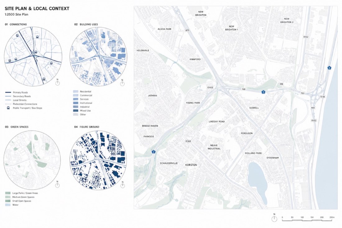
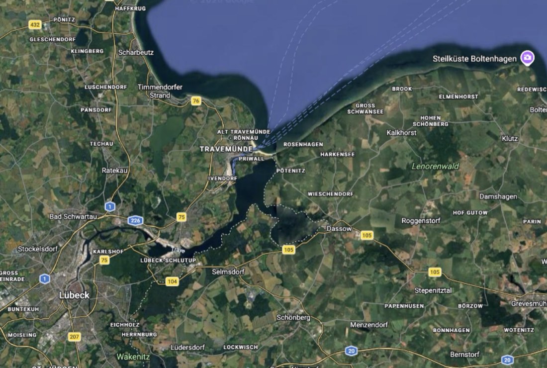
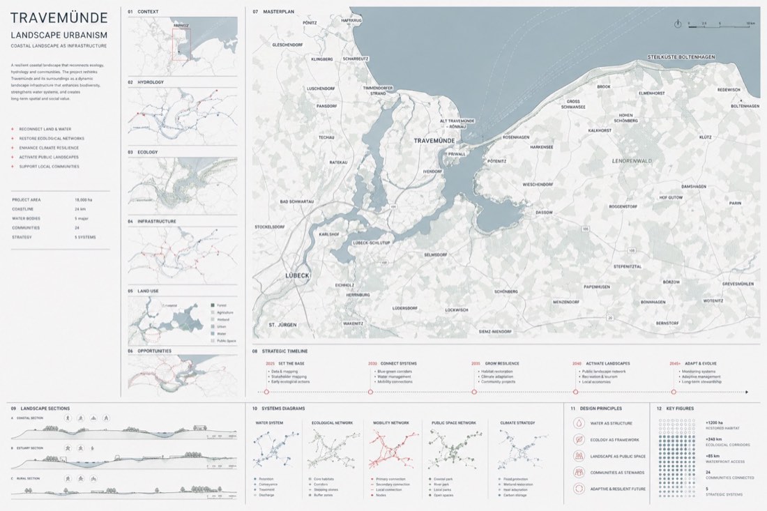
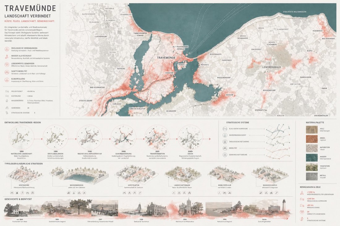
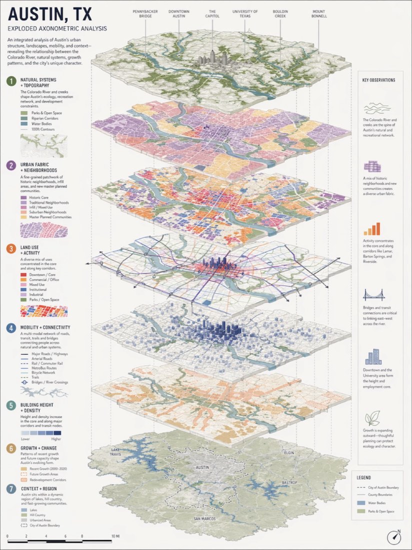
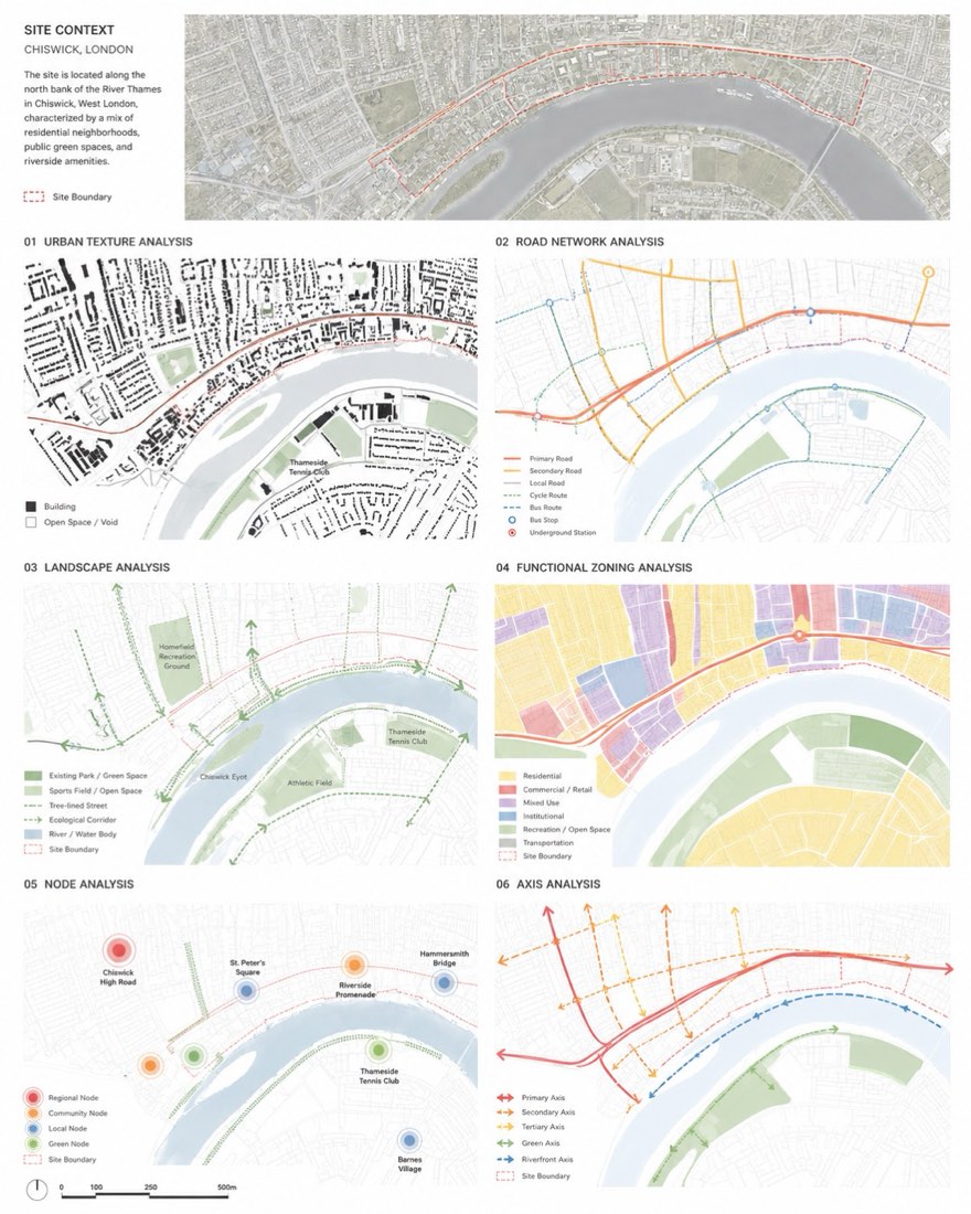
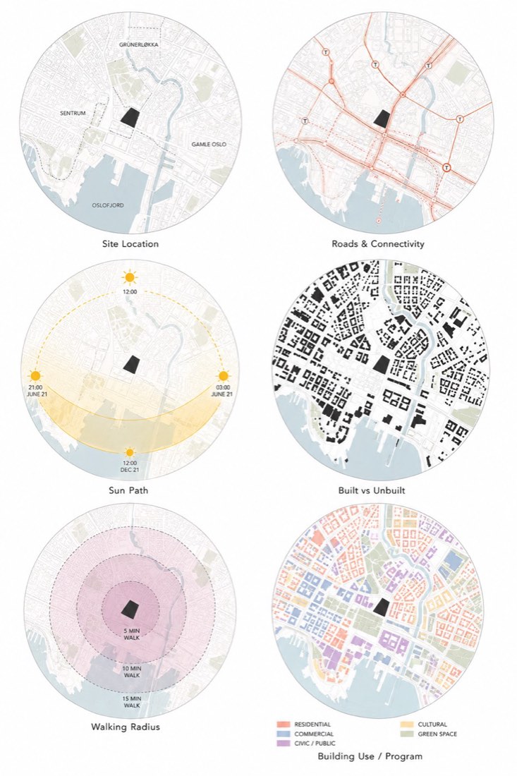
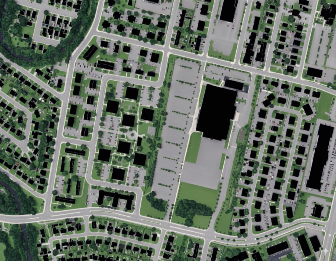
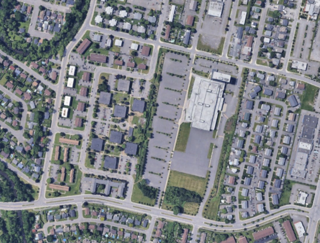
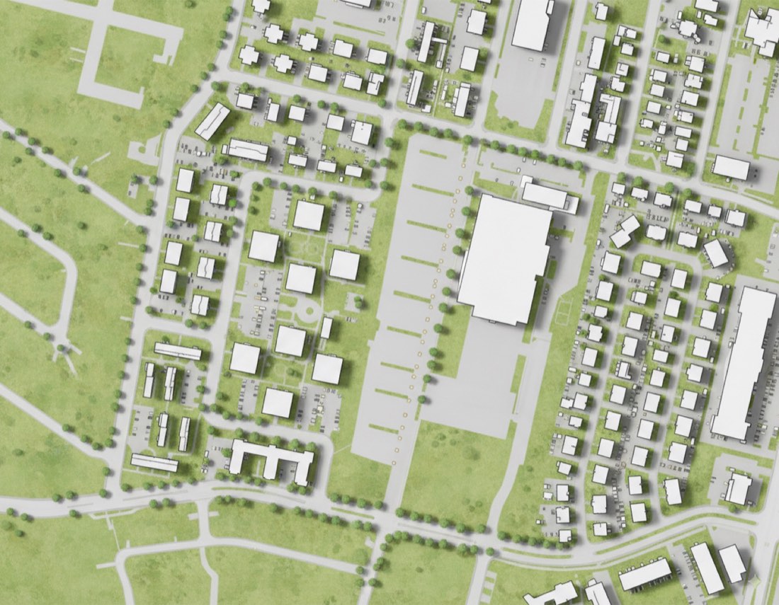
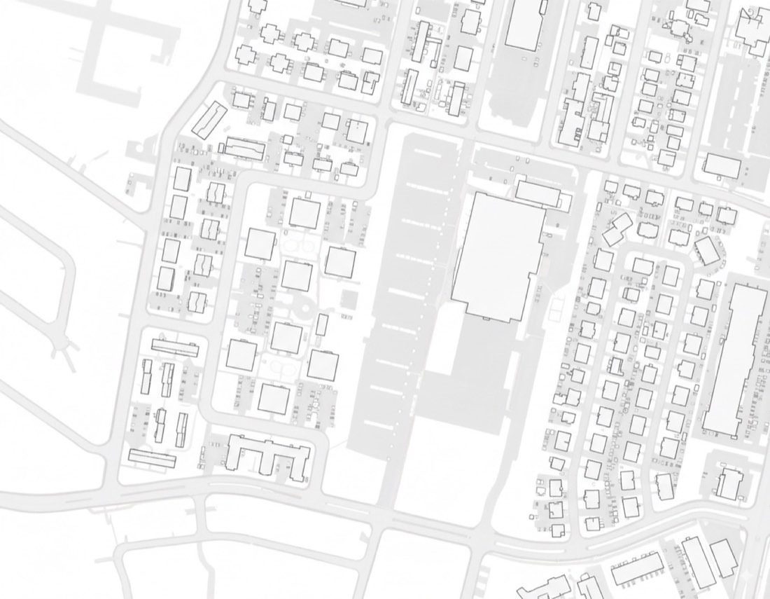
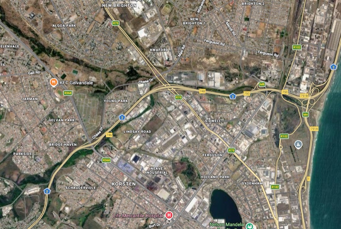
Transform my uploaded site plan / urban context map into a professional architectural SITE PLAN & LOCAL CONTEXT analysis board in the same graphic language as the reference. IMPORTANT — PRESERVE THE REAL SITE: Treat my uploaded plan as the fixed geographic base. Preserve exactly: - site boundary - street network - building footprints - block structure - existing open spaces - major infrastructure - orientation - surrounding urban fabric - relative scale and proportions Do not redesign the site. Do not invent roads, buildings, blocks, or landscape features. Do not distort the original geography. BOARD LAYOUT: Create a clean landscape-format architectural analysis board on a pure white background. Use an asymmetrical editorial composition: LEFT SIDE — approximately 35–40% of the board Create four small analytical diagrams arranged in a clean 2 × 2 grid. RIGHT SIDE — approximately 60–65% of the board Create one large detailed contextual site plan. Maintain generous white negative space between all diagrams. MAIN TITLE: Place a small bold title in the upper-left: SITE PLAN & LOCAL CONTEXT: BELOW IT, ADD A SMALL SUBTITLE: 1:2500 SITE PLAN: Use compact architectural sans-serif typography. 01 — CONNECTIONS: Create a circular analytical map derived from the actual site plan. Show: - primary roads - secondary roads - pedestrian connections - public transport / bus stops where applicable - important movement routes - relationship between the site and surrounding street network Use different line weights rather than excessive colors. Primary routes: dark desaturated navy-blue. SECONDARY ROUTES: MEDIUM MUTED BLUE.: LOCAL CONTEXT: VERY PALE BLUE-GREY.: Keep the diagram minimal and diagrammatic. 02 — BUILDING USES: Create a second circular analytical map using the same geographic extent. Classify surrounding buildings by program where information is available, such as: - residential - commercial - services - institutional - mixed use - other relevant categories Represent each category using a restrained monochromatic blue palette. DO NOT USE RAINBOW COLORS.: Keep streets and background context extremely pale so the building-use information is dominant. 03 — GREEN SPACES: Categorize green spaces according to aerial photo. Use progressively darker shades of the same blue family. large park = pale green. small open space = dark navy-green. Maintain exact footprints from the source map. 04 — FIGURE GROUND: Create a simplified architectural figure-ground diagram. Remove unnecessary contextual information. SHOW ONLY: BUILDINGS: solid dark desaturated navy-blue. GROUND / STREETS / OPEN SPACE: pure white. Preserve the exact real building footprints and urban morphology. This diagram should be extremely clean and abstract. MAIN CONTEXTUAL SITE PLAN: On the right side, create a much larger detailed site plan showing the complete local urban context. Use precise architectural / GIS-style linework. Existing surrounding buildings: very pale grey-blue outlines with subtle transparent fills. ROADS: PALE COOL GREY.: MINOR STREETS: EXTREMELY LIGHT GREY.: Landscape / open space: very pale desaturated blue-green or grey-green. WATER, IF PRESENT: VERY PALE MUTED BLUE.: The site should be clearly visible without becoming a large saturated graphic shape. Use subtle transparent blue overlays to identify important local relationships. Add only a few carefully selected analytical lines where useful. Do not overcrowd the main map with arrows, icons, labels, or graphic effects. COLOR PALETTE: Use a tightly controlled monochromatic architectural palette. SUGGESTED COLORS: DARK NAVY #174B63: DEEP BLUE #2F6B86: MEDIUM BLUE #6F9EB6: SOFT BLUE #AFC9D6: PALE BLUE #DCE8ED: VERY PALE BLUE-GREY #EEF3F4: CONTEXT GREY #D9DDDD: WHITE #FFFFFF: OPTIONAL MUTED LANDSCAPE TONE: #DDE8E2: Use approximately 80–90% white / pale grey context and only 10–20% stronger blue information. Do not introduce additional saturated colors. GRAPHIC LANGUAGE: The final result should resemble a professionally prepared architecture / urban design analysis board created using: CAD + GIS + ILLUSTRATOR + INDESIGN.: CHARACTERISTICS: - precise vector-like linework - thin grey contextual lines - flat color fills - restrained transparency - consistent blue palette - clean circular analytical diagrams - strong information hierarchy - generous white space - small architectural typography - minimal legends - subtle north arrows - professional competition-board aesthetic VERY IMPORTANT — AVOID AI LOOK: Do NOT use: - gradients - glowing edges - watercolor textures - painterly effects - 3D buildings - perspective - realistic trees - decorative shadows - random blue patches - excessive transparency effects - artificial texture - blurred boundaries - thick outlines - oversized icons - unnecessary arrows - invented urban information All colors should appear as clean, controlled, mostly FLAT vector fills. The image should look manually constructed in Illustrator / InDesign from accurate CAD or GIS data, NOT generated by AI. FINAL OUTPUT: Strict orthographic top-down representation. LANDSCAPE ORIENTATION.: One large contextual site plan + four smaller analytical diagrams. PURE WHITE BACKGROUND.: Precise, minimal, highly legible architectural graphic design. The uploaded site geometry must remain accurate throughout all five diagrams.